Sunday 26 October 2014

OUGD403 - Studio Brief 03 - Study Task (News paper Layout)

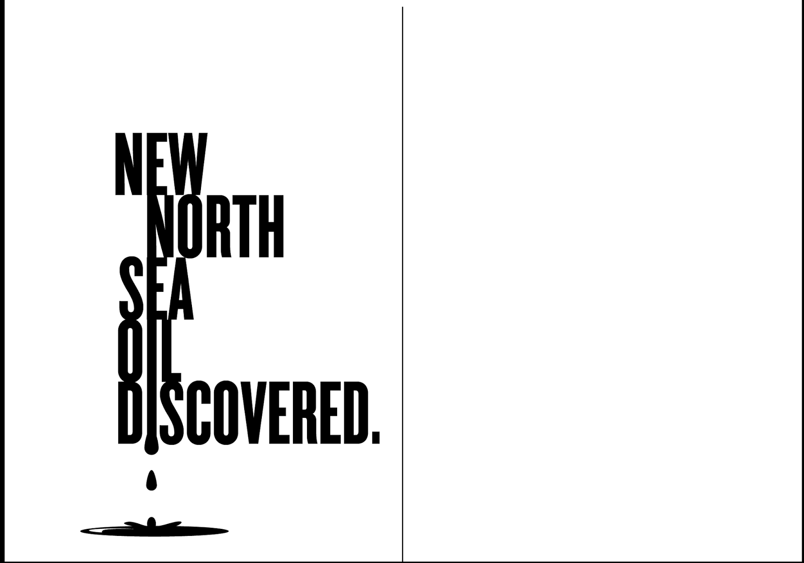
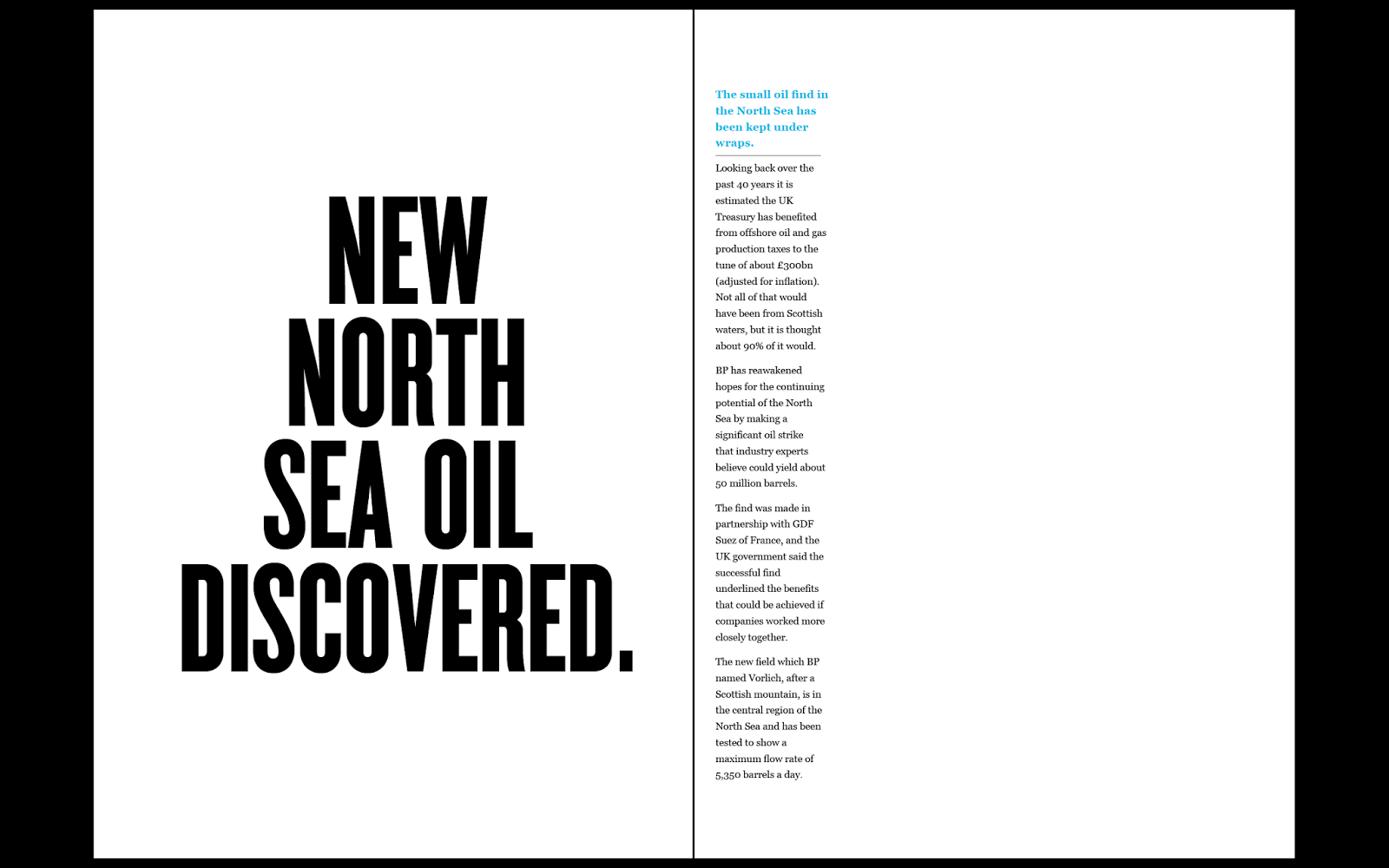
For this task we were split into small groups of 4 or 5, each group was given a different news paper article/story to study and collect information from. The name of our article was 'New North Sea Oil Discovered' 

When we had become familiar enough with the story we were given we began to create a hand rendered response to that story.

We based this response on how the story was shown in the media, the fonts and images that we collected during the research, and the views and comments from the general public and officials.
We worked together and discussed how our work would look and respond to the story, Our hand rendered copy of our response was a rough copy of what the perfect form would be using Adobe In Design.


Below is our final digital response:


Saturday 25 October 2014

OUGD401 - Study Task 02 - Modernism & Postmodernism

Modernism 

Is taking away the 'confusing, 'messy looking' 'busy' and old fashioned style of thinking in art and design. We replace it with 'simple' 'clear' 'refreshing' 'to the point' way of design. 

Typography is the perfect example to explain the age of Modernism.

Typography in a modern style should relate to 'neutralism' and an eye pleasing design. Helvetica being the perfect example of a modernist typeface. 


http://hdw.eweb4.com/out/982194.html 

Looking back in time to advertisement, we come across the busy, messy, colourful splash of mixed fonts, images and colour all over a piece of work. from our our point of view now in this modernist age we see this way of thinking to be messy and unclear, almost fake in a way. Now we see that most advertisement work will use some style of crisp, bold and clear typeface to really get to the point of what is being advertised. Helvetica being the perfect example.

Below is a an image of Modernist work by Massimo Vignelli 

(Massimo Vignelli, Bob Noorda. New York City Subway Guide. 1970)

Massimo Vignelli, Bob Noorda. New York City Subway Guide. 1970


http://www.moma.org/collection

It is perfect example of simple, clear and understandable informative design work. The fact that we can instantly tell what this is by glancing proves that it is. the Helvetica font used for the title strait away tells us what the piece of information is and what will be inside. 


Post Modernism 

Is the idea of the style coming after Modernism.

It is the style of design that relates to the modernism age but at the same time 'rejects it', Post Modernism is a reaction to modernism, it carries the same principles of being 'new', 'modern' and 'fresh'. It takes on both individuality and the logic of Modernism. So really we are experimenting with the idea of modernism, because we are wanting to express ourselves through out work but at the same time trying to stick to the current more preferred modernistic way of thinking. 

Below is an example of Post Modernistic design work.

(San Antonio, Public library, Texas, designed by architect Ricardo Legorreta Vilchis)


https://www.boundless.com/art-history/ 

This is a perfect example of individuality and Modernism together, The building is the definition of Modernism but at the same time is still rejecting the idea of complete basic clarity and neutralism. 


Friday 24 October 2014

OUGD403 - Studio Brief 02 - Study Task 02 - Grids and layout

Before starting my own grid in response to my chosen typeface and designs created from that, i carried out some research on various books, magazines and websites to find out how grids are used on a daily basis both in design work and natural life. 

I first began to re create the grids using pages from typography books I used from the college library, i found some interesting pages mixed with images, annotations and text and began creating a grid for them in my own image. i ended up with a few complex and simple grid designs which i then compared. i then looked at different social media websites such as facebook, twitter and instagram, just to see how the the different elements of the page were laid out, the grids for these websites turned out to be very basic, maybe this is because social media websites are created for 'ease of use' therefore the grid designs for the layout would not have been complex.


I also looked at how grids have been used over time and the idea of grids fitting into the natural world, how they are used in everyday life without us being aware of it. 

http://www.graphics.com/article-old/brief-history-grids

http://webdevstudios.com/2014/09/26/why-grids-matter-a-review-from-chaos-to-order/

Grid systems are used in so many things from 'bee hives' to our own 'face', they are used to bring order to chaos both in the design world and the natural world. 

When looking back in time to see the earlier and more famous designs of grids I came over a few famous grid designs:

The Golden ratio has thought to have been used for at around 4000 years in art and design, but is believed it may have been used longer before that time, based on the idea of Egyptians using the golden ratio to build pyramids,

The golden ratio can be seen in in all types of art and design, it is believed that the golden ratio sets the idea of beauty and the more that something is closer to the use of the golden ratio the more beautiful that 'something' is supposed to be, whether it be a human face or a piece of art work.
Below is the idea that the golden ratio had been used to paint the 'Mona Lisa'.


The Van de Graaf 'secret canon', is another type of grid that is used in book design so a page can be divided into pleasing proportions and sections, in a way that is also pleasing to the eye. The 'secret canon has been used for a long time, it was used in the creationj of medieval manuscripts and incunabula. 
below in an image of the grid and a link to a video on how the draw the grid by hand.


http://www.realmagick.com/van-de-graaf-canon/ 

www.youtube.com/watch?v=MRUR52oTAP8


The Rule of Thirds is used in creating images it is supposed to set the basis for well balanced images by laying all elements out in proportion.


http://digital-photography-school.com/rule-of-thirds/


After my research I felt I had enough knowledge to go ahead and begin to create a grid for my 26 letter forms of the alphabet, in the typeface Helvetica, I used an original font, once I had created by complex grid I could then use that grid to manipulate the Helvetica font to relate to my word 'charisma' and the idea of 'spirituality'. 


Thursday 16 October 2014

OUGD404 - Task 1 - Design Principles

I explored three different typefaces that I had never used before, using the letters A,B,C,X,Y,Z in upper-case and lower-case form, I produced these letters in all three fonts I chose, to a 10/10 cm scale. I then took my 12 separate print outs to the class to create something new with my group. Each person had created these separate print outs, each person in the group had chosen three different typefaces to use. So we began by discussing and conversing the characteristics of our letters and the fonts we chose. It is actually very interesting to see how each font we were looking at differed from one another, even fonts that looked almost identical when looked at closely could be separated because of the slight differences, because of the way the designer had created that typeface. 

After sharing the typefaces we had chose we each selected our favourite from our print outs. I really liked the typeface 'Amarta' Purely because in the font I had used, to me, looked 'strong' and 'bold' yet 'personal'.
Everyone in the group chose their favourite font and we discussed the reasons why. We then put all of our favourite pieces together then worked to create a completely new font! based on all of our choices. After a some development we had created our own upper-case and lower-case font, which we had decided to call 'Gothura' it had a Gothic, stylish and bold look to it. When deciding on one final word to describe our new design we agreed on 'playful', in relation to this we then made costumes completely of paper.. so based on our final descriptive word, we had made a outfit which seemed to be a cross between a king and a clown. which surprisingly being made out of paper turned out to be a successful attempt at costume making.


Thursday 9 October 2014

OUGD403, Studio Brief 1 - Visual Thinking - Alpahbet Soup

Using the font HELVETICA, i will now begin to create a set, series or a sequence of ten letterforms, i now have been given my own word to work with 'CHARISMATIC', i think there are a lot of ideas i can create from using this word, one idea i had was to use the work of 'Si Scott' a very successful artist who creates amazing pieces of work using spirals and loops. Also i have the idea of using large chunky broken down illustrations around my work to give it a more 'personalised' look. 

OUGD403, Studio Brief 1 - Visual Thinking - Alphabet Soup

I started this brief with a small task to decide which font i would be using in my work, the font i eventually chose was 'HELVETICA', based on the questions i feel that this font suited me best.