Saturday 21 February 2015

OUGD404 - Studio Brief 02 - Study Task 04 - Bookbinding

I was given the task to attend a workshop and In a group create my own three books, each with a different type of binding. 

During the workshop we created books with a perfect bound spine, Concertina, and thread held.

Each type of spine had a very different method of preparation and design. The first book spine, we created by collecting a number of different pages together and using needle and thread to carefully stitch together the pages along with a colored cover. The process was a little tricky because, as I was trying to force the needle through the center of the pages to create the spine, i also had to keep the book form intact, so not to ruin the final design, or overall look of the book.


The second book we created was with the perfect bound spine, this was probably the most difficult out of all three. Using PVA glue and crosshatch material against a large number of pages we pushed the glue against the spine of pages harshly, so that the glue would ever so slightly stick all of the pages together. After around ten minutes of this, the book was left to try inside a wooden clamp, to keep the pages intact and to let the glue dry and keep the pages together. After a 30 minute wait the glue had dried and the pages were stuck firmly stuck together. This then allowed us to add a coloured covering for the front and back, and a thin strip of coloured leather to cover the spine,to give the book a more appealing look when finished.


The last spine design was the concertina, which really is a spineless book, but it is the structure of the pages which make the spine. Taking a certain number of pages, each page was folded and placed against each other in a zigzag style pattern. Then using PVA the certain pages were stuck together to create an unfolding array of pages. The pages were left to try, and after this the we could then add a hard front and back cover. Using very thick cloth material, we glued this to very thick board whicg just over matched the size of the unfolding pages. after the front and back covers had dried, these were then stuck to outside of the first and last page and then firmly pressed together with a wooden clamp. 


I really enjoyed the entire process of creating my own books. I really like the professional feel and look each book has, and the materials and instruments I used the make them. 


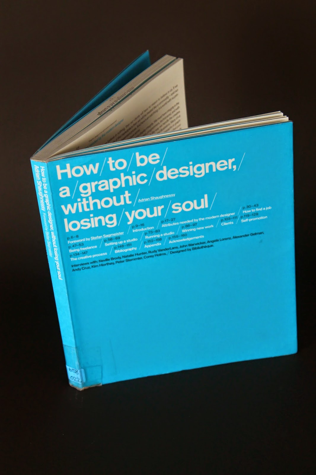
After making my books and taking them away with me, I was then given the task to attend a photography workshop to experiment with different lighting and to eventually use this to take multiple photos of the my books, at different angles to experiment and see how lighting works with photography. 

To start off the induction we were taken through a short intro into which settings on the camera would best suit our purpose. We were given the chance to around the studio and out around into other areas to refresh our photography skills. Afterwards we came back to the initial studio to begin setting up a background and lighting, ready to take our photos. As a group we were split into partners and began working on our photos and playing around with lighting until we were happy with what we had captured


Below are my final photo's.


The purpose of the entire process was to learn about the preparation and design of book making and different spine deigns. Then using photography on the books to enhance my skills and knowledge about photography and lighting.


Friday 20 February 2015

OUGD406 - Study Task 03 - Typographic treatment

In this study task I was I was to design an appropriate typographic treatment for the book cover for my given book.

To do this I examined the original cover of my given book 'How to be a graphic design without loosing your soul'. 
Because the design of this book is already quite simple and modernistic, quite text heavy I struggled to find an alternative design that would relate more to the title. However I then had the idea to just redesign the original piece but in a more definitive way, something that came across more full and text heavy.


Below is my redesign/treatment


By using Armata as the modernistic font relating to the original design, since I could only use text for this task I enhanced the importance of what the title is actually highlighting.


Tuesday 17 February 2015

OUGD406 - Studio Brief 02 - Study Task 02 - Book Cover Analysis

I have been given the task to carry out some research and analyse the cover of my given book 'How to be a Graphic Designer Without Loosing Your Soul'.


http://www.autostraddle.com/freelance-graphic-designer-the-kit-137089/

I first found out that the cover of this book was designed by 'Bibliothèque' a design company that create work fro many different types of media and purposes. Websites, print, posters, retail, packaging and much more.


'Bibliothèque produce compelling printed literature that communicates with clarity and authority, from a best selling book, through to marketing materials, property brochures and annual reports'
http://www.bibliothequedesign.com/projects/communications/


There is definitely some consistency between the design of this book and vast amount of other designs that this company have crated. quite a modernistic style with everything and when looking at the definition of how the company came to this design for the cover of this book, this is the information they gave 'Text-heavy books often appear dry and academic. To counter this, a strong typographic palette was devised. Having introduced the contents on the front cover, a flexible grid was adopted for the spreads, enabling a controlled level of expression' 
http://www.bibliothequedesign.com/projects/communications/how-to-be-a-graphic-designer/

Within the book, it is clear that every page for each section of the book is connected to the design of the books cover, the way the information is separated, and the use of blue and white to make priority to some information, or pages than others. 


When looking through certain sections of the book that appealed to me and taking in the preface and introduction to the book, it told me that this book picks up on the problems that new emerging graphic designers are going to face in their career. The initial message that this book is promoting is 'How to be a graphic designer without losing your soul addresses the concerns of young designers who want to earn a living by doing expressive and meaningful work, and who want to avoid becoming hired drones working on soulless projects'. 

https://books.google.co.uk/books?id=BaoMZtdVPGEC&dq=how+to+be+a+graphic+designer&source


The way the author has written this book is based on his own experience. The author seemed to have interpreted his own still ongoing experiences within his career, from personal designs and work he has produced for clients. The author talks about how to keep your 'soul' from being taken away from your work to please the 'majority'. This is how the author interprets the message of the book. 


When relating the message of this book to the cover and overall design of the book, personally it seems to almost 'defeat' the point of the message, as beautiful as it is. Meaning that I think that the cover of this book is quite 'soulless', there is not much to look at, and the design of the cover does seem to follow the modernistic, simplistic design that you would find on a lot of design work that aesthetically pleases most eyes. There is definitely not a lot of personal expression in this cover design. 
However, maybe this does work on a certain level, the fact that this book cover does look a little soulless, somehow does connect to the title of the book and to some degree does interpret the overall message of the book. Making the ready think more about the title of the book rather than how it looks. 


OUGD404 - Studio Brief 02 - Study Task 03 - Type Setting

For this study task, I was given the objective to re typeset Lewis Carrolls - A Mouses Tale using a postmodern approach and a modernist approach.

The Mouse's Tale
by Lewis Carroll

"Mine is a long and a sad tale!" said the Mouse, turning to Alice, and sighing. "It is a long tail, certainly," said Alice, looking down with wonder at the Mouse's tail; "but why do you call it sad?" And she kept on puzzling about it while the Mouse was speaking, so that her idea of the tale was something like this:—
Fury said to a mouse, That he met in the house, 
“Let us both go to law: I will prosecute you.”
Come, I'll take no denial,
We must have a trial,
For really this morning I've nothing to do.
Said the mouse to the cur, 
“Such a trial, dear sir, 
With no jury or judge, 
would be wasting our breath.”
“I’ll be judge, I'll be jury” 
Said cunning old Fury; 
“I’ll try the whole cause, and condemn you to death."

I began with some research into the poem and found that the text of the poem already has a style of it's own.
The poem itself is part of the book 'Alices Adventures in Wonderland'. An image of the original poem is below. 


The poem is about a mouse speaking of it'self in third person, the overall feeling to the poem is a negative one.
As the poem continues the amount of lines it is structured by becomes increasingly shorter and shorter meaning eventually after only a few words the poem needs to start on a new line. the reason for this style is so that the poem 'looks like a mouses tale'. It is quite effective being that this is a poem about a mouses tale in the shape of a mouses tale.

After looking at the original poem I noticed that it already has it's own post modern style. It is not a modernist design as it does not fit in with today's society idea of modern design, but it is postmodern. In a way that how the poem has been structured breaks the boundaries of what most poem structures usually look like, 'more or less box shaped'. I would say it is refreshing to see something different. 

I then started working on my own post modern structure for the poem, playing around with the lines and the shape. 

I ended up with sort of following the same theme as the original design but putting the text in a different structure, the wavy lines is the perfect post modern example, which let me break the boundaries of normal text box shape but still allowed the text to be readable.


Then my own version of a modernistic design, was a little more simple and easier to achieve, whilst thinking of minimalism and ease of access and use, I found myself concentrating where exactly the text would fit on the page, rather than the structure of the text itself. 


So I decided to keep the text structure center left of page so i got the idea of perfection and simplicity to the reader also to give a sense that
'something is more modernistic and different about this', I lined the title, vertically against thetext.

Sunday 15 February 2015

OUGD406 - Study Task 01

I have been given the task to analyse a book that I randomly picked from a pre selection. 


The book I have analysed is 'How to be a Graphic Designer Without Loosing Your Soul' Authored by Adrian Shaughessy, Edited by Eugenia Bell and Published by Laurence King Publishing Ltd.


After reading the preface and introduction to this book, in my own words, here are the notes and ideas that I personally took and gained from it:


The book 'How to be a Graphic Designer Without Loosing Your Soul', has been written by a self taught designer for new only just emerging designers. The main purpose of the book is about what a designer is to do when things go wrong in the design process in a graphic designers career and it helps independent designers deal with the less attractive side during working with a client.
It is a book to help people who think that graphic design has a more asthetic value beyond how it is portrayed and it is for people who want to go into this type of design because they are attracted to personal expression and creation. The book will also relate to people who have it in their minds that graphic design is seen as a somewhat glamorous role compared to past when graphic design was seen more an an artistic occupation with not that much status attached to it.


The book will also talk about how design is now very competitive, how designers are falling and are being forced into a compliance of design.
Linking to this the boom will then go on to talk about how that on one hand there are people who believe that graphic design is a problem solving tool should incorporate as little self expression as possible. Then on the other hand there are people who believe graphic design is a tool but is enhanced by personal expression.
How the idea of self expression through the work of a graphic designer being made for a client should not be used so strongly.. that this type of behavior is only acceptable for so special acclaimed designers, when actually this is not the case, that self expression is universal. 
As self expression through a designers work is suppressed by society, clients and media. There is a sense of defiance which says (quoted from the introduction), 'a little bit of my soul went into this and it's not going to be removed without a fight'.
This book will not tell a designer information that they do not want to know, referring to how a designer is and individual and how every designer wants to self express, and will have little interest in following or complying with the strategies of other same level designers.


Instead the introduction of this book explains that it will help designers get answers to the questions that are most asked such as:


'How do you respond to crap briefs?'

'How do you stop clients demanding unreasonable changes to your work?'
'How do you find interesting work?'
'How do you make good work and make good money?'
'How to stop clients changing your work?'


And so on, as these question link back to the beginning point in that is mentioned in the introduction to this book about designers understanding the less attractive side of this career.


After going through these points i realized that the context of the book is to somehow inform the 'just emerging graphic designer' and to snap the average graphic designer back into reality.


The author of this book 'Adrian Shaughessy', after carrying out some research i found that the author has made a substantial amount of different books, all relating to graphic design. 


Graphic Design: A users manual 


"This book offers students, novice designers, and battle-toughened professionals alike an insider's guide to the complexities of current graphic design practice and thinking. 
It contains all you need to know to survive and prosper in the complex, ever-shifting world of graphic design. Set out in A-Z style and written in a realistic, conversational, and insightful way, the book provides advice on the fundamental topics and issues that face designers in their daily lives. It looks at everything from kerning to presenting, from budgeting to dealing with rejection, from annual reports to interface design"

https://books.google.co.uk/books?id=3a8XAQAAMAAJ&q=graphic+design:+a+users+manual&dq=graphic+design:+a+users+manual


Cover art by: New Music Graphics 

"The album cover is still a subject of perennial interest amongst graphic designers. Sleeve design remains a popular subject for college theses and many young working designers aspire to design for the music industry. Revealing the state of the art of contemporary music graphics, Cover Art By: is packed with over 400 examples of sleeve art. As well as CD and album covers, the insides of CD booklets and the backs of vinyl sleeves are shown. The book opens with an in-depth essay reviewing the current scene, then focuses on the work of 30 international designers/labels who are the most influential in the field. Also included is a list of important record labels with contact details, making this a must-have for designers and students, as well as music industry professionals and fans."
https://books.google.co.uk/books?id=m4vqAAAAMAAJ&q=cover+art+by:+new+music+graphics&dq=cover+art+by:+new+music+graphics


Look at this: Contemporary Brochure, catalogues and documents

"Printed brochures, catalogs, and multi-page documents form the bedrock of many graphic designers' daily practice. Most printed literature is disposable: todays hot communication document is tomorrow's landfill. But the best brochures, catalogs and documents have a permanence and organic completeness that has become essential in this ephemeral, and increasingly electronic, world of instant communications. This book features the best of contemporary printed literature design. It offers a critical survey of current work by leading practitioners from the U.S., Europe and the Far East. Arranged in a designer-by-designer format and accompanied by interviews, this book offers a complete and informative picture of this popular subject."
https://books.google.co.uk/books?id=fkcwnjzH8qIC&dq=look+at+this:+contemporary+brochures,+catalogues+%26+documents

A sample of books from the selection i saw and decided to carry out a little research on, it is clear that this author covers a vast amount of different artisitic, designer, self expressive and media related subjects all relating to graphic design. 


Tuesday 10 February 2015

OUGD406 - Studio Brief 01 - Professional Practice - Secret 7

I have been given the information for the live studio brief 01:

In this brief I am to create a piece of art work in response to a chosen song from a pre selection. The work i produce will be transformed into a 7" record sleeve and then entered along into a charity competition along with 1000's of other 7" record sleeves created from other designers and artists. 

Below are the pre selected songs I have to choose from:


The Chemical Brothers - Let Forever Be
The Supremes - Reflections
The Maccabees - Go
Peter Gabriel - Sledgehammer
The Rolling Stones - Dead Flowers
St. Vincent - Digital Witness
Underworld - Born Slippy

I will take the time to view and listen to all of the songs and then choose the one that I feel i can
respond to best. I will need to be able to connect to the visuals, type, and sounds of the song
I choose before i can begin creating designs in response to it.
I will start by carrying out some research on a few different celebrated music artwork
designers so I can get a little inspiration and ideas before I begin my own.
Peter Saville
A graphic designer who has mad a career from designing record sleeves for many different
factory record artists.
Album artwork by Peter Saville
After looking through the artists work i realized that he has created a vast amount of different
styles and genres, and has uses a lot of really interesting photography in his work.
http://www.dezeen.com/2013/09/20/design-by-peter-saville/
Jamie Reid 'Jamie Reid's unique vision articulates and gives form to some of the key issues of our times.
He responds to the ever-increasing attacks on our civil liberties and shared common spaces
with passionate anger and savage humor, and shows us ways in which we might re-organise
our political and spiritual resources. This is the role of the shaman and Reid's art acts like a
lightning rod, returning us to the earth so that we might share the work of healing'.
Jamie-1.jpg

Jamie-2.jpg

Jamie-3.jpg

Jamie-4.jpg

NPDec1.jpg
NPDec2.jpg
www.jamiereid.org/about/

Annie Leibovitz:

Annie Leibovitz, considered one of America's best portrait photographers, developed her trademark use of bold colors and poses while at Rolling Stone.
http://www.listal.com/list/work-annie-leibovitz

Storm Thorgerson
'Storm Thorgerson, was the sleeve designer behind weird and wonderful images for
Pink Floyd, Ian Dury and the Mars Volta'.
Storm Thorgerson: 10CC- Are You Normal
Storm Thorgerson: Alan Parsons- Try Anything Once
Storm Thorgerson: Black Sabbath
Storm Thorgerson: Pink Floyd
http://www.theguardian.com/music/gallery/2009/may/20/storm-thorgerson-album-artwork
I really enjoy this designers work, I think it's very creative. I especially like the last piece I
shared, with the triangle breaking the light, anything to do with sharp looking work, triangles,
glass, reflective designs and light i just find it personally responds to myself in some way.

Now that I have carried out some research and seen how the artists above have taken a
piece of information or someone else's idea and created an image or piece of design in their
own vision. 


After listening to all of the pre selected songs i decided to choose 'The Maccabees - Go'. When
listening to the song i got a sense of a free sounding style, maybe a little emptiness to the song which could be related to simplicity.., at times the song would seem very sharp and then sometimes very soft and dreamy.
Personally I think the song is quite holistic.

I felt i could definitely create the design work in response to this song.


So instantly after listening i pictured simple/bold colors, along with patterns. Also the idea 
of certain objects having a deeper meaning, or an image of something that communicated a message.
I carried out some more research on patterns, imaginative and bold design, so I could begin playing around
with different ideas.

Geometric patterns vector animals
Geometric patterns paintings

Geometric patterns

 Landshape

 Matt Booth

 bird

 wine bottles

 Patternbooth

I love all of these images above, I find it really interesting how simple shapes can be repeated and applied 
towards something much more complicated and interesting. I really love the bold color use in some of the 
pieces of art above. Even images that use a vast amount of different hues and shades, just seems to work towards the bigger image 'thing' that the shapes are creating. 
http://www.creativebloq.com/graphic-design/geometric-patterns-11135236

http://design.tutsplus.com/tutorials/a-beginners-guide-to-digital-textile-printing--vector-3189

http://www.nopattern.com/

So, taking forward what ideas I had gotten from my chosen song and the inspiration I got from my research, I began taking photos of objects that related to what I wanted to design.

I began to think of an object I could use that would relate to the ideas of 'deeper meanings', 'bold color use' and patterns. I came up with the idea of using old CD and DVD discs and manipulating them. Discs have the ability to 'bend light', so reflecting the colors of the spectrum that altogether make white light, 'Bold colors'. The discs also relate to the fact that the work I am designing is connected to music and at the same time, these discs a breakable and the material they are made from allows me to manipulate them.

So I took several photos that i could then use in a range of ideas.


I then manipulated the images in Photoshop, until i had different designs, such as patterns with different colours, and single new images, I took the idea of pattern and repetition and simple but strong color use into my designs.

Below are my final designs. 


By using broken sections of a CD, I tried to make an image of a tree with a plain green background, I did this so the cover would relate to the peaceful, dreamy sounds that I got when listening to my chosen song.


For this cover i used the same image but just experimented with a different background color to relate to the broken light on the damaged CD image. I also used a white outline as a border to bring some order to the cover.


When experimenting with the idea of patterns, I used my broken CD images to make a pattern effect and transformed the new images into the shape of a triangle. I decided on the shape of a triangle because personally the shape reminds me of 'perfection', and since the song had quite a holistic feel to it, I thought a triangle fitted this best. A cool blue background to keep the focus on the triangle image.


This design is one of favorites, I manipulated the tree image I had created even further, then experimenting with the patterns I had made and put them into a square shape, just to see what it would look like and it seemed to work, so i kept the square theme going for the rest of the image. Using a blue background for the same purpose as last time.


This is my favorite design, deciding on using a triangle as the shape my patterns fit into to keep the idea of perfection being the word to describe the holistic feel of my chosen song, then repeating the image and changing it's direction and placing both triangular image against each other to represent one whole image. Because i wanted to create a message of 'no direction', I personally think that massage relates to the overall sound and feel of the song. I also used a cool pink background to match the color of the main image more. Then using white outlines to bring order. 

I then prepared my favorite design (above) and uploaded it to the secret 7 website.