I have been given the task to produce a set of 10 Double page layouts that explore the form, function and construction of a book.
By carrying out research into various book design, layouts and stock, text, image choice, and exploring my own ideas, I will build the elements i need to design my own book, first my exploring different layouts that respond to my chosen content.
For this brief I have decided to go with the idea of mental relaxation and physical rest. I want to create designs that are simple yet effective that communicate the message (hints and tips) of self clarity and a calm mind.
This type of content instantly makes me think of sharp edged shapes, windows, light, air, spacious, white, light grey, blue, triangles, geometrical shapes, light text, easy to the eye images and expressive order.
All of these points I will explore and first communicate through a set of various designs.
I started by thinking of the very basic. the actual shape of each page, how my design will differ from any one else's. I want to stand out and catch the attention I will need to promote my designs.
The shape of each page of an average boom is usually rectangular or square. For each separate page in my book I will break the norm by altering the open edge of each page, by slicing of the shape of a triangle to leave a clean slightly altered edge.
Below are images that show the idea that i want to achieve.


How each page will look different, but together as a 10 page book I think will look very effective. Text, shape and image element will work along with my page design.
Working on from the edged of pages that I have decided to work with, I have began to start the creation of my front cover. To me the front cover is the most important part of any type of book because it is the first thing that the reader sees, it sets an instant image in the readers mind as to what the book will be like inside, not only the text but the design too. As I pointed out before, I want my book to have a modernistic style, much less illustrative than my previous work, the idea of a sharp look and feel is important.
After I had carried out some research on modernistic book covers, I thought about introducing colour to my designs. I will be able to work with the book cover and the contents menu to introduce more colour.
This is the idea I have of how i can introduce colour into my work, by using multiple colours which will be more effective, I can start the basis from the contents and the front cover.
I have decided to separate my work into topics of information which I have collected from sources and personally, I will apply the information and imagery to the triangular look and feel of the inside pages of my book.
Since my book is about mental and physical well being, I carried out some research into information that would be useful for my choice of content.
I have decided to describe and communicate (music, foods, environment, scenery, mental imaging, mind stimulation, consumerism and meditation). I will carry out the research from various websites, and collect what I need to communicate my content.
Below are the websites I will use to to help me communicate my topic:
http://newsinhealth.nih.gov/2010/January/feature1.htm
http://www.cracked.com/article_18405_7-insane-ways-music-affects-body-according-to-science_p2.html
http://drlwilson.com/Articles/sleep.htm
http://www.health.com/health/gallery/0,,20459221,00.html
https://students.case.edu/health/medical/nutrition.html
http://www.huffingtonpost.com/simple-thrifty-living/can-shopping-help-anxiety_b_5936748.html
http://www.artofliving.org/meditation/meditation-for-you/benefits-of-meditation
https://www.psychologytoday.com/blog/the-integrationist/201306/7-tips-creating-positive-mental-imagery
As well as the use if external sources for the content of my book, I wanted my book to have a personal twist, so I decided to incorporate my own feelings and experience, in a way that I can express how 'I carry out certain methods to help myself relax and stay calm during stressful times'. As this subject is something that is important to myself on a personal level. So it felt right to include my own words and those that I have collected from my family and friends.
When I had collected the information to use in my book I began to think about what images I can use through the pages of my book to help communicate my topic. So I began to think about what images or environemnt makes me feel calm and relaxed. I began to think of home and the environemnt that used to surround me before moving to Leeds for university.
At home the environment is wide open spaces and plenty of nature and detailed, interesting landscapes. I decided that during my visit home over the spring break, I would take the oppertunity to spend some photography time in the moors and collect as many images as I could that i personally thought would communicate a sense of peace and well being.
Below are the images that I managed to capture and the ones that I have chosen to use in my book.
As I mentioned earlier, I do want to incorporate more colour in my work so I will manipulate and alter my images on photoshop, by changing, cropping and enhancing the colour to suit the purpose of my book, the stronger the colour the more personality I feel my book will have.
I could now begin working on my actual design with the elements and ideas that I have. I plan to design a simplistic design, which uses triangles as image barriers, guides and the overall feel of each page which will work with the text, imagery and colour.
I created thumbnails of what each main page will hopefully look like below:
In my mind I will use triangles as the guides for the text and image work and the general feel of each page, Each page will work with the image.
For the text my font choice will be Armata, which is my prefered font for most work as it is modernistic and clear, and I think for my content it will work best.
After playing around with my designs, below are my final page layouts:
I am really happy with my final design, I fell that i have created something quite modernistic as a book design. It's simple, clean yet effective, the layout is exactly how I imagined it to be. I think my choice in manipulating my photography work was a good decision, It adds a more personal effect to the design.
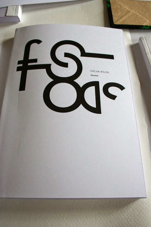
Also another design choice I made during the creation of my book was altering the text that made up the header for section of the book, by extending the length of some of the characters I have created a more modernistic look.
For the printing stage I have decided to use thin white card for the pages and a slightly thicker card for the front and back cover.
When deciding how to bind my book, I initially wanted to have by book perfect bound, unfortunately I have not managed to produce that style of binding which I am disappointed about, but for the purposes of submission I will have to staple bind my book.