During the photography induction I were told about the the department, the studios that were available, the cameras and equipment that I could access, the borrowing and booking service was also explained to me if I should ever require to use equipment or the studios for the course.
During the induction a few simple camera effects, alterations and details were explained and demonstrated to me. Later on in the session I were given a camera and told to go off in the college, inside or out and use what I had learnt about altering effects of the camera to take a number of photos.

Wednesday, 19 November 2014
Sunday, 16 November 2014
OUGD403 - Studio Brief 04 - Delivery
The brief for SB4 was to create 3 high impact posters based on a message that I had to create from the information and research i had collected from SB3.
One poster would have to be completely created from images, the other poster created completely from text and the final poster created from a combination of image and text. All three posters had to effectively communicate my message to an audience.
Here are my finished designs:


Here are my finished designs:
Above is my image and text poster demonstrating an authority figure and an random person, the authority figure looks down on the random person, along with the text, 'don't give up, speak up'.
My text only poster emphasises on the question 'am i invisible', as if to say, 'are you listening to me'
This is probably my favourite out of all three posters, i have used the dame authority figure theme but created a silhouette for the image to really connect to the message i am trying to get across, also i have used a background for this poster to link to the idea of a negative presence in a city. I have laid out the image in the shape of a speech bubble, to prepare the poster as a comment.
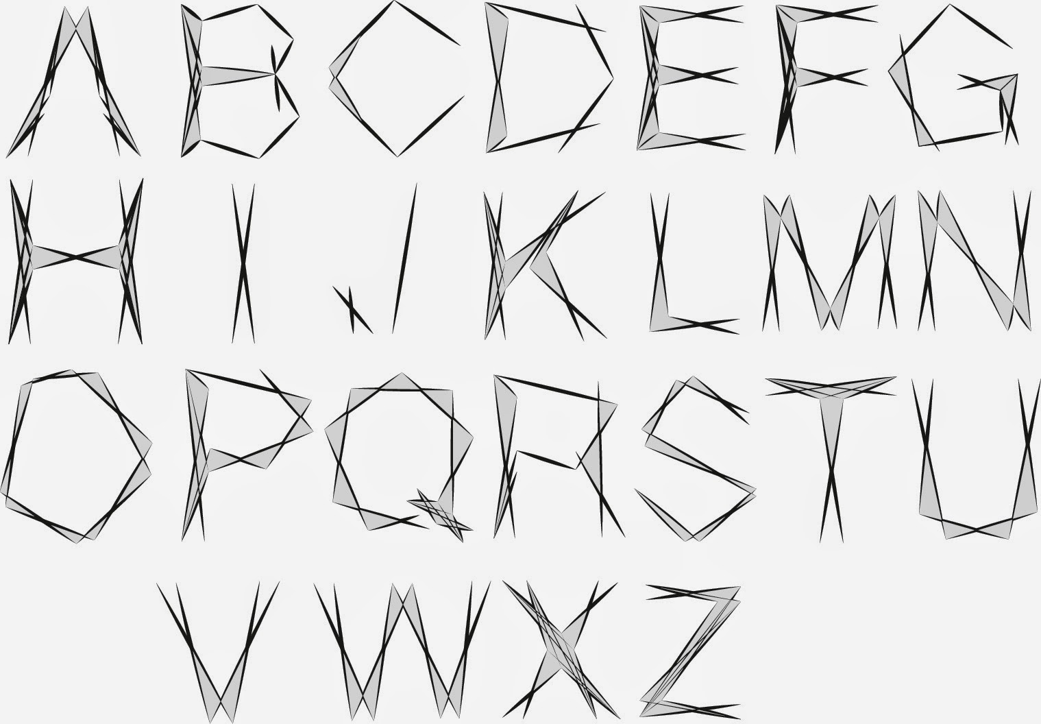
OUGD403 - Studio Brief 02 - Finished Alphabet
I am very happy with how my final piece has turned out for SB2, working on from my final ideas from SB1 I have successfully developed it into a design that i can use for all letter forms of the alphabet.
I feel I have managed to show this idea of a personalised, fine look connecting to spirituality and positivity through my this piece of work.
I am also happy with my final grid designs, both fro individual letter forms and the structure of my alphabet as a whole, I know that I could now use these grids to really help me draw out each letter of the alphabet in my own design.
along with the presentation of my finished alphabet and finished grids, I presented and example of using letters of my alphabet to create words that connected with how my design looked, also I decided to the process of how I developed the font Helvetica into my own image.
OUGD404 - Studio Brief 1 - Finished Letterforms
Here are my finished letter forms, I am very pleased with how they have turned out, I feel that have successfully managed to apply mu final design to every single letter form and I feel that I have created this idea of spirituality, positive, light looking design to my work..
Saturday, 15 November 2014
OUGD403 - Studio Brief 1 - research
I have carried research connecting to the word 'charisma' I carried out the research so i had a better understanding of the word charisma, then i could begin to relate to it and start applying ideas that i gain from the research to my letter forms.
I first began with a full definition of the word charisma, from this i realised that someone with a charismatic personality is someone who is likeable, strong spirited and positive. so from these connected words i researched images that would help me with ideas to apply to the letters.


I first began with a full definition of the word charisma, from this i realised that someone with a charismatic personality is someone who is likeable, strong spirited and positive. so from these connected words i researched images that would help me with ideas to apply to the letters.
http://s539.photobucket.com/user/yogoslover/media/TWILIGHT-Title-1.gif.html
http://www.fromupnorth.com/in-focus-illustrator-si-scott/
http://www.airbrushaction.com/shattered-glass.html
These are the main images that i will base all of my ideas on, this idea of simplicity but a personal design.
Sunday, 9 November 2014
OUGD404 - Fire Exit redesign
We Explored how a 'Fire Safety sign' plays an important part in society and every day life, even though it is a very minimalist design with very little use of colour and shapes, it is a widely known and recognised piece of deign.
In this session we were given the task to re create the Fire Safety sign in our own image, keeping it simple and to the point. We were able to alter the design in any way we wanted, use any colour, shaping and text.
We were split into small groups, and together we explored a range of ideas and debated on what elements would be used in our final design, some time after playing around ideas on the mac and discussion we worked on the final piece.
Whilst sticking to the original design, we explored a different shade of colour, a different font and a different layout. We were happy with the final outcome because it expressed our own ideas for the re design, it related to the simplicity of the design and at the same time it was easily understandable and produced the message which it needed to.
Monday, 3 November 2014
OUGD404 - Task 03 - Colour
We explored colour, shading and light in this session, the entire class had been split into 3 large groups. We were told the week before this session to turn up wearing something in the colour we were given and we were each told to bring in 5 separate items in the given colour, mine was blue, the other two groups had green and yellow. Everyone had brought 5 separate items and working in groups we began put all of the 'blue' items together.
First we began by putting them into a darker to lighter shade of blue scale, this was a little tricky because there were a lot of items to try and place in the correct shade, the scale went from a purple/dark blue to a very light blue.
Then each group swapped over so we could make changes and decisions on the other groups work, we then returned back to our own tables to see the changes.
Then working with the same items we started on a different scale, from warm to cold, so looking at each blue item we had to decide weather it was a warm blue or a cold blue. This proved very difficult because blue is already considered as a cold colour. Although we eventually worked out the scale eventually.
Then leaving the items to one side, we began to look at all of the clotting we hd dressed up in to respond to our colour. We were then told as a group to scale ourselves from dark to light based on the shade of blue we were wearing.
The session was very useful, i feel i have become more familiar with shading and how to work with colour in a scale.
OUGD403 - Studio Brief 03 - News Paper Research
For this task we were to go and purchase a newspaper on a specific date which was given to us in the brief. With out chosen new paper(s) we were to pick one story or article that we could relate to in some way or feel the need to respond to.
My chosen newspaper was the 'Yorkshire Evening Post' and my chosen article was 'How would you tackle, problems in Leeds'.
I chose this article because i recently moved to Leeds to study, so when I saw the article, I was drawn to it instantly. The article spoke about the various issues in Leeds that the public had began to speak out about. the article showed statistics in problems that needed correcting, how the public felt and thought and what the public thought would be best for their community to help improve in the issues that were being raised.
I responded to this article by going to collect more articles similar to this story as well as online research so i could create a knowledge base into 'what had and is being done to help improve and minimise these issues that were being raised by the public'.
I quickly began to find various online sources and stories telling me what leaders of Leeds city council had done to fix these issues, I was collecting evidence to back up my response.
When I felt I had enough positive sources in response to this negative article, i began to put together a set of information sheets, filled with images, quotes and information to explain what I had found. I then presented my research to a group of 10 people from the class to share what I had found, and my own personal views and thoughts in the initial article and what I found out in response to that.
Sunday, 2 November 2014
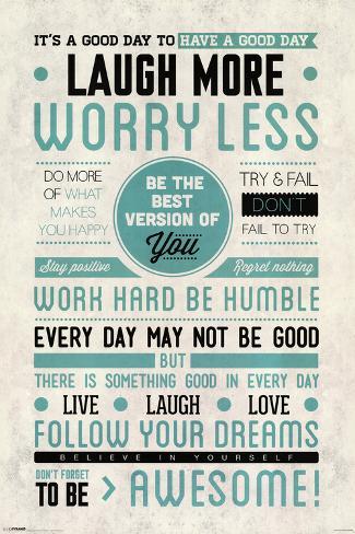
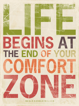
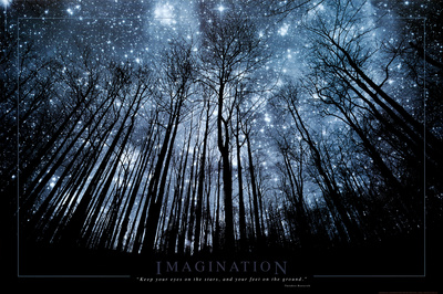
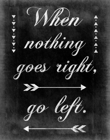
OUGD403 - Studio Brief 04 - Poster Research
I have been given the task to research various types of posters, so i have a broad range of different designs and styles.
I really like inspirational and posters that promote positivity, at the same time I love the idea of something being simplistic and easy to connect to, a poster should be able to get a message across instantly.
Below are a few poster motivational and inspirational poster designs from www.allposters.co.uk which I liked:


This will help me to understand how a message is given through a piece of advertisement art.
I really like inspirational and posters that promote positivity, at the same time I love the idea of something being simplistic and easy to connect to, a poster should be able to get a message across instantly.
Below are a few poster motivational and inspirational poster designs from www.allposters.co.uk which I liked:

Music Posters -


Festival Posters - http://bluefaqs.com/2010/03/60-creative-and-inspiring-festival-posters/


Posters for advertisement - http://graphicdesignjunction.com/2012/09/50-fresh-examples-of-advertising-posters/


All these designs produce a separate message, with a different style. Looking at each poster you can see how the use of shapes and grids have been used along with any text to build up the effective image. I love the simple use of colour and shading on some of these designs, for those that express a mix of various colours help to keep the design interesting and attractive.
Subscribe to:
Comments (Atom)