Monday 1 December 2014

OUGD405 - Studio Brief 02 - Study Task 01

For this task I worked in a group of 4.

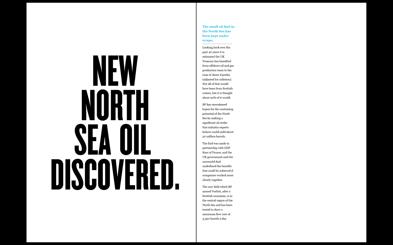
We were given the task to take and research a selected company that sponsor a British football team. each group was given the name of a different company that sponsored this football team. The task was to carry out some research on the given company name by looking at the website, taking in the concept design of that company and then re creating the design concept in our own image to potentially somehow make it better. 
My group was given the company 'Enterprise Insurance'. An insurance company that we eventually found out had a boring, informative design and website. 

To challenge this we began by researching more into the company.

We found out that this company that was sponsoring a British football team was actually based in Spain. We researched more into this certain area in Spain and found that it had it's own flag seperate to Spain. Coincidentally the colours of this flag happened to match the colours of the football team it sponsored, 'Red and white'. Also this flag had on the image of a key.
We then as a group decided to use the colours of the flag and the image of the key in our own re creation of the design for this insurance company.
We used the image of the key because we felt it connected to the word 'insurance' being that it holds the words 'safety', 'secure', 'controlled'. 

We used this to first completely re design the logo for this company, by using the idea of the key and the colours red and white. 


We also re created the website for this company to replace the old boring design and look with something simple and fresh which held our theme of the use of a key and the colours red and white. 


I did not really enjoy this task because personally I felt I did not gain any new knowledge from it. However I did enjoy working in a small group with people that I had not worked with before. I feel that we worked well as a group to produce the final design concept. 

Wednesday 19 November 2014

Photography Induction

During the photography induction I were told about the the department, the studios that were available, the cameras and equipment that I could access, the borrowing and booking service was also explained to me if I should ever require to use equipment or the studios for the course. 

During the induction a few simple camera effects, alterations and details were explained and demonstrated to me. Later on in the session I were given a camera and told to go off in the college, inside or out and use what I had learnt about altering effects of the camera to take a number of photos.

Sunday 16 November 2014

OUGD403 - Studio Brief 04 - Delivery

The brief for SB4 was to create 3 high impact posters based on a message that I had to create from the information and research i had collected from SB3. 

One poster would have to be completely created from images, the other poster created completely from text and the final poster created from a combination of image and text. All three posters had to effectively communicate my message to an audience. 

Here are my finished designs:


Above is my image and text poster demonstrating an authority figure and an random person, the authority figure looks down on the random person, along with the text, 'don't give up, speak up'.


My text only poster emphasises on the question 'am i invisible', as if to say, 'are you listening to me'


This is probably my favourite out of all three posters, i have used the dame authority figure theme but created a silhouette for the image to really connect to the message i am trying to get across, also i have used a background for this poster to link to the idea of a negative presence in a city. I have laid out the image in the shape of a speech bubble, to prepare the poster as a comment.


OUGD403 - Studio Brief 02 - Finished Alphabet

I am very happy with how my final piece has turned out for SB2, working on from my final ideas from SB1 I have successfully developed it into a design that i can use for all letter forms of the alphabet. 
I feel I have managed to show this idea of a personalised, fine look connecting to spirituality and positivity through my this piece of work.

I am also happy with my final grid designs, both fro individual letter forms and the structure of my alphabet as a whole, I know that I could now use these grids to really help me draw out each letter of the alphabet in my own design.  

along with the presentation of my finished alphabet and finished grids, I presented and example of using letters of my alphabet to create words that connected with how my design looked, also I decided to the process of how I developed the font Helvetica into my own image.


OUGD404 - Studio Brief 1 - Finished Letterforms

Here are my finished letter forms, I am very pleased with how they have turned out, I feel that have successfully managed to apply mu final design to every single letter form and I feel that I have created this idea of spirituality, positive, light looking design to my work..


Saturday 15 November 2014

OUGD403 - Studio Brief 1 - research

I have carried research connecting to the word 'charisma' I carried out the research so i had a better understanding of the word charisma, then i could begin to relate to it and start applying ideas that i gain from the research to my letter forms. 

I first began with a full definition of the word charisma, from this i realised that someone with a charismatic personality is someone who is likeable, strong spirited and positive. so from these connected words i researched images that would help me with ideas to apply to the letters.


http://s539.photobucket.com/user/yogoslover/media/TWILIGHT-Title-1.gif.html


http://www.fromupnorth.com/in-focus-illustrator-si-scott/


first

http://www.airbrushaction.com/shattered-glass.html


These are the main images that i will base all of my ideas on, this idea of simplicity but a personal design.


Sunday 9 November 2014

OUGD404 - Fire Exit redesign

We Explored how a 'Fire Safety sign' plays an important part in society and every day life, even though it is a very minimalist design with very little use of colour and shapes, it is a widely known and recognised piece of deign. 

In this session we were given the task to re create the Fire Safety sign in our own image, keeping it simple and to the point. We were able to alter the design in any way we wanted, use any colour, shaping and text. 

We were split into small groups, and together we explored a range of ideas and debated on what elements would be used in our final design, some time after playing around ideas on the mac and discussion we worked on the final piece.


Whilst sticking to the original design, we explored a different shade of colour, a different font and a different layout. We were happy with the final outcome because it expressed our own ideas for the re design, it related to the simplicity of the design and at the same time it was easily understandable and produced the message which it needed to. 


Monday 3 November 2014

OUGD404 - Task 03 - Colour

We explored colour, shading and light in this session, the entire class had been split into 3 large groups. We were told the week before this session to turn up wearing something in the colour we were given and we were each told to bring in 5 separate items in the given colour, mine was blue, the other two groups had green and yellow. Everyone had brought 5 separate items and working in groups we began put all of the 'blue' items together.

First we began by putting them into a darker to lighter shade of blue scale, this was a little tricky because there were a lot of items to try and place in the correct shade, the scale went from a purple/dark blue to a very light blue. 
Then each group swapped over so we could make changes and decisions on the other groups work, we then returned back to our own tables to see the changes. 

Then working with the same items we started on a different scale, from warm to cold, so looking at each blue item we had to decide weather it was a warm blue or a cold blue. This proved very difficult because blue is already considered as a cold colour. Although we eventually worked out the scale eventually. 
Then leaving the items to one side, we began to look at all of the clotting we hd dressed up in to respond to our colour. We were then told as a group to scale ourselves from dark to light based on the shade of blue we were wearing. 

The session was very useful, i feel i have become more familiar with shading and how to work with colour in a scale. 


OUGD403 - Studio Brief 03 - News Paper Research

For this task we were to go and purchase a newspaper on a specific date which was given to us in the brief. With out chosen new paper(s) we were to pick one story or article that we could relate to in some way or feel the need to respond to. 

My chosen newspaper was the 'Yorkshire Evening Post' and my chosen article was 'How would you tackle, problems in Leeds'.

I chose this article because i recently moved to Leeds to study, so when I saw the article, I was drawn to it instantly. The article spoke about the various issues in Leeds that the public had began to speak out about. the article showed statistics in problems that needed correcting, how the public felt and thought and what the public thought would be best for their community to help improve in the issues that were being raised.

I responded to this article by going to collect more articles similar to this story as well as online research so i could create a knowledge base into 'what had and is being done to help improve and minimise these issues that were being raised by the public'.
I quickly began to find various online sources and stories telling me what leaders of Leeds city council had done to fix these issues, I was collecting evidence to back up my response.

When I felt I had enough positive sources in response to this negative article, i began to put together a set of information sheets, filled with images, quotes and information to explain what I had found. I then presented my research to a group of 10 people from the class to share what I had found, and my own personal views and thoughts in the initial article and what I found out in response to that.


Sunday 2 November 2014

OUGD403 - Studio Brief 04 - Poster Research

I have been given the task to research various types of posters, so i have a broad range of different designs and styles.
This will help me to understand how a message is given through a piece of advertisement art.

I really like inspirational and posters that promote positivity, at the same time I love the idea of something being simplistic and easy to connect to, a poster should be able to get a message across instantly.

Below are a few poster motivational and inspirational poster designs from www.allposters.co.uk which I liked:


Music Posters - 


Festival Posters - http://bluefaqs.com/2010/03/60-creative-and-inspiring-festival-posters/


Posters for advertisement - http://graphicdesignjunction.com/2012/09/50-fresh-examples-of-advertising-posters/


All these designs produce a separate message, with a different style. Looking at each poster you can see how the use of shapes and grids have been used along with any text to build up the effective image. I love the simple use of colour and shading on some of these designs, for those that express a mix of various colours help to keep the design interesting and attractive.


Sunday 26 October 2014

OUGD403 - Studio Brief 03 - Study Task (News paper Layout)

For this task we were split into small groups of 4 or 5, each group was given a different news paper article/story to study and collect information from. The name of our article was 'New North Sea Oil Discovered' 

When we had become familiar enough with the story we were given we began to create a hand rendered response to that story.

We based this response on how the story was shown in the media, the fonts and images that we collected during the research, and the views and comments from the general public and officials.
We worked together and discussed how our work would look and respond to the story, Our hand rendered copy of our response was a rough copy of what the perfect form would be using Adobe In Design.


Below is our final digital response:


Saturday 25 October 2014

OUGD401 - Study Task 02 - Modernism & Postmodernism

Modernism 

Is taking away the 'confusing, 'messy looking' 'busy' and old fashioned style of thinking in art and design. We replace it with 'simple' 'clear' 'refreshing' 'to the point' way of design. 

Typography is the perfect example to explain the age of Modernism.

Typography in a modern style should relate to 'neutralism' and an eye pleasing design. Helvetica being the perfect example of a modernist typeface. 


http://hdw.eweb4.com/out/982194.html 

Looking back in time to advertisement, we come across the busy, messy, colourful splash of mixed fonts, images and colour all over a piece of work. from our our point of view now in this modernist age we see this way of thinking to be messy and unclear, almost fake in a way. Now we see that most advertisement work will use some style of crisp, bold and clear typeface to really get to the point of what is being advertised. Helvetica being the perfect example.

Below is a an image of Modernist work by Massimo Vignelli 

(Massimo Vignelli, Bob Noorda. New York City Subway Guide. 1970)

Massimo Vignelli, Bob Noorda. New York City Subway Guide. 1970


http://www.moma.org/collection

It is perfect example of simple, clear and understandable informative design work. The fact that we can instantly tell what this is by glancing proves that it is. the Helvetica font used for the title strait away tells us what the piece of information is and what will be inside. 


Post Modernism 

Is the idea of the style coming after Modernism.

It is the style of design that relates to the modernism age but at the same time 'rejects it', Post Modernism is a reaction to modernism, it carries the same principles of being 'new', 'modern' and 'fresh'. It takes on both individuality and the logic of Modernism. So really we are experimenting with the idea of modernism, because we are wanting to express ourselves through out work but at the same time trying to stick to the current more preferred modernistic way of thinking. 

Below is an example of Post Modernistic design work.

(San Antonio, Public library, Texas, designed by architect Ricardo Legorreta Vilchis)


https://www.boundless.com/art-history/ 

This is a perfect example of individuality and Modernism together, The building is the definition of Modernism but at the same time is still rejecting the idea of complete basic clarity and neutralism. 


Friday 24 October 2014

OUGD403 - Studio Brief 02 - Study Task 02 - Grids and layout

Before starting my own grid in response to my chosen typeface and designs created from that, i carried out some research on various books, magazines and websites to find out how grids are used on a daily basis both in design work and natural life. 

I first began to re create the grids using pages from typography books I used from the college library, i found some interesting pages mixed with images, annotations and text and began creating a grid for them in my own image. i ended up with a few complex and simple grid designs which i then compared. i then looked at different social media websites such as facebook, twitter and instagram, just to see how the the different elements of the page were laid out, the grids for these websites turned out to be very basic, maybe this is because social media websites are created for 'ease of use' therefore the grid designs for the layout would not have been complex.


I also looked at how grids have been used over time and the idea of grids fitting into the natural world, how they are used in everyday life without us being aware of it. 

http://www.graphics.com/article-old/brief-history-grids

http://webdevstudios.com/2014/09/26/why-grids-matter-a-review-from-chaos-to-order/

Grid systems are used in so many things from 'bee hives' to our own 'face', they are used to bring order to chaos both in the design world and the natural world. 

When looking back in time to see the earlier and more famous designs of grids I came over a few famous grid designs:

The Golden ratio has thought to have been used for at around 4000 years in art and design, but is believed it may have been used longer before that time, based on the idea of Egyptians using the golden ratio to build pyramids,

The golden ratio can be seen in in all types of art and design, it is believed that the golden ratio sets the idea of beauty and the more that something is closer to the use of the golden ratio the more beautiful that 'something' is supposed to be, whether it be a human face or a piece of art work.
Below is the idea that the golden ratio had been used to paint the 'Mona Lisa'.


The Van de Graaf 'secret canon', is another type of grid that is used in book design so a page can be divided into pleasing proportions and sections, in a way that is also pleasing to the eye. The 'secret canon has been used for a long time, it was used in the creationj of medieval manuscripts and incunabula. 
below in an image of the grid and a link to a video on how the draw the grid by hand.


http://www.realmagick.com/van-de-graaf-canon/ 

www.youtube.com/watch?v=MRUR52oTAP8


The Rule of Thirds is used in creating images it is supposed to set the basis for well balanced images by laying all elements out in proportion.


http://digital-photography-school.com/rule-of-thirds/


After my research I felt I had enough knowledge to go ahead and begin to create a grid for my 26 letter forms of the alphabet, in the typeface Helvetica, I used an original font, once I had created by complex grid I could then use that grid to manipulate the Helvetica font to relate to my word 'charisma' and the idea of 'spirituality'.