Monday, 14 August 2017

(NEW) OUGD505 - SB02 - Further Research into Issues in Chechnya


Further research into families being pushed into treating their own gay relatives less than 'human beings'


A report from the trusted news source 'Pink News' states in a report that the leader of Chechnya believes that 'families should kill their gay relatives'.

"Chechnya’s leader Presdient Ramzan Kadyrov has defended honour killings of gay men.
Speaking to HBO, the Chechen president said that he would defend the rights of families to murder their gay relatives.
‘Honour killings’, or the murder of relatives due to the belief that the victim has brought shame to the family, are illegal in Russia and Chechnya."

"President Kadyrov once again denied reports of the gay purge in the region, however.
“If there were any gay people living in the region, then they should move to Canada.
He also said that “they are not people”.

The comments came after David Scott of HBO asked Kadyrov about “the alleged roundup, abduction and torture of gay men in the Republic”.
Kadyrov retorted: “Why did he come here? What’s the point of these questions?
“This is nonsense. We don’t have those kinds of people here.
“We don’t have any gays. If there are any, take them to Canada,” he said.
He went on to add that homosexual needed to be removed from Chechnya to “purify” the “blood” of the region".

This shows the underdeveloped method of thinking which is considered normal in the Russian country.


http://www.pinknews.co.uk/2017/07/19/chechnyas-leader-ramzan-kadyrov-families-should-kill-their-gay-relatives/


Sunday, 13 August 2017

(NEW) OUGD505 - SB02 - Research into current issues in Chechnya


Families that are being forced to turn in their own relatives to authorities if they are known to be gay

Families who reside in Chechnya are known to being forced by authorities to alert police if any of their relatives are known to be gay. 

A report from the independent states that there are reports in which explain how parents are being threatened by police to "kill their gay children or the state will intervene".

Which was explained by a survivor who was being held one of the alleged torture camps.

"The latest account of systematic LGBT persecution comes just a month after Chechen authorities allegedly rounded up more than 100 men who were suspected to be gay. Many were tortured and at least four are alleged to have been killed, according to a Russian newspaper and human rights campaigners".

“They tell the parents to kill their child. They say ‘Either you do it, or we will. They call it: ‘Cleaning your honor with blood.".

The report states similar discussed information in which 'gay people do not exist in the country of Chechnya, which the leader of Chechnya uses to back up his statement that 'such allegations are ridiculous lies'.

A spokesman for Ramzan Kadyrov, the head of the Chechen Republic, said reports that more than 100 men were detained in April was “absolute lies and disinformation” and claimed gay people did not exist in the region.

“You cannot detain and persecute people who simply do not exist in the republic,” the victim told Interfax news agency.


http://www.independent.co.uk/news/world/europe/chechnya-parents-kill-gay-sons-russia-region-government-chechen-leader-ramzan-kadyrov-a7714591.html

(NEW) OUGD505 - SB02 - Research - Minimal Colour inspiration


After researching into some modern booklet designs I soon realised that getting the colour way correct for my design may have a very large impact on the overall and some individual aspects of the design both inside and out. 

So I started some research into images that expressed objects and similar events that were created with minimalist colour and tones, and style that most would say is fairly modernist, which is the style I would prefer for SB2.

Pinterest seemed to be the key for this so below are the images that I absolutely loved.

And a few points on why and how they are relevant to my booklet design.

COLOUR


The Image above displays s collection of colours that I find aesthetically pleasing, I'm not sure how but these colours and shades work very nicely together and create a sense of joy, this maybe something to take forwards into the colour of vector shapes. (shaping used to enhance design and structure).


Acknowledging the fact that the colour way is monochrome, the layout of this image is what interests me most. It is beautiful and delicate, it's quite and interesting imager to look at, there is so much detail and the it's the layout which clearly breaks the expectation of what people are used to seeing. The layout is something I will take inspiration forwards to my booklet design.


This photography piece is equally beautiful. The models dark skin contrasts so well with the cover design. The shades of grey are very pleasing and balancing.


I appreciate these shades and I may possibly take them into my design as inspiration


The same again for these shades


I find the negative space works well with the image of Londons network and the monochrome colour way creates a fairly modern design which would also work well for my booklet design.


I adore this product design. The chalky deep grey is a wonderful hue combined with the deep greens from the herbs and olives, really makes for a beautiful combination, very modernist.


The shades of greys in this image are very calming and express maturity.

HOMEWEAR STYLE


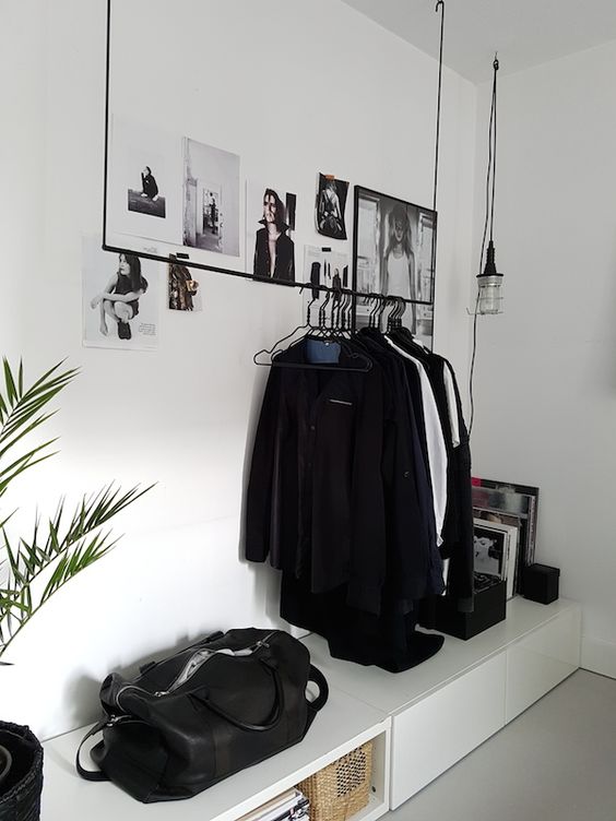
I also came across these images of modernism and minimalism being brought into peoples homes. These monochrome shades make for a very beautiful and calming space. Drawing so much attention to detail, layout and material.

The images above display shades that I would like to take forward into my booklet design as inspiration of modern design and layout.


(NEW) OUGD505 - SB02 - Research - Modern Booklet Design


I would like to go for a more modern design style for this new response.

I have come across some very neat websites that display very large collections of beautiful and modern Booklet designs, all with different kinds of binding, finishes, color etc. 

The first website I like is

https://designmodo.com/25-clean-modern-brochures-examples/

A post created by either a designer or researcher featured some very nice examples, a few of which I downloaded to keep.
How ever this one below is by far my favorite out of the collection. The layout, color and the quality of image behind the text are absolutely amazing. I assume that the booklet has something to do with nature which seems very clear on each page. 


I'm sure I am very used to designing something so enhanced on each page, however, this example definitely wants to make me experiment with color and image size more.


The next website I came across is a blogging website. A more independent post with many strongly designed examples.

http://jayce-o.blogspot.com/2014/01/examples-of-modern-booklet-designs.html 

DESIGN 01


This style of the design, I feel definitely represents modernism at it's best, the use of white space is very effective on the displayed pages and such use of white space really draws attention to the elements of image and text. The monochrome colour choice really compliments the maximised use of white space also.

DESIGN 02


Equally just as impressive is this booklet design above. The first element to draw my attention is the stock colour choice, (pastelised pink) which massively boosts the quality of this booklets appearance as it is defies expectation of normal white stock. The layout within the featured pages are very similar to that of the previous design. However because of the stock colour choice, much more attention is brought to the separation of the displayed images and then the positions of text which follows on the next page. A definite example of clean, modern design.

DESIGN 03/04


The above designs are just as beautiful. Again the use of white space is so complimentary to the images and the text. In design 03 the monochrome colour way fit's so well with the dreamy pink stock and almost creates a sense of secrecy, a very inviting trait for any design. Design 04 is beautifully impressive, the balance of text and image on the displayed inner pages is perfect and the front cover is simplistic and modern, the cover colour choice (print orange) creates a very zen impression to the booklet.

DESIGN 05


This booklet is by far the best from the collection (personal choice) The displayed booklet cover is stunning from the colour way to the layout, it is the perfect example of aesthetically pleasing design and modernism. The choice in colour compliments the image at it's best. The displayed inner pages are mostly autumnal coloured images, the overlapping style really makes for something effective and somehow, comforting to the eye.


The examples of modern booklet design above, are examples that I will definitely be taking inspiration to aid my booklet design process.

Tuesday, 8 August 2017

(NEW) OUGD505 - Studio Brief 02 - New Response Design Idea


For my third attempt of a response to studio brief 02 I have decided that I will be working on something that has a lot more direction and purpose. 

Going through and evaluating different options I decided that I will take the direction of designing an effective booklet that has the ability to inform and influence.

I will keep the subject the same, as I do not see any other reason as to why I should look for a new global issue to work on. I feel that the current Issues in Chechnya have an emotional effect on many people as well as myself, I would like to keep the subject the same to battle against homophobic behavior and to create awareness of the issue.

I would like this booklet design to be much stronger than the previous poster designs which were created. The key to this is to use information from trusted sources which are real and raw, information which really paints the picture in just a few lines of text. Combining this quality of writing with modern design could possibly be the perfect response for SB2.


#CHECHNYA
#BOOKLET
#MODERNISM


Monday, 19 June 2017

OUGD505 - SB02 - Development and Final designs


After carrying out research into art method of Russian Constructivism, The issues in Chechnya and research into design that inspires and informs I have managed to work on and complete a series of posters which I feel really represent Chechnya in a new and fresh way whilst also having the ability to inform people of the issues currently taking place.

The first design expresses method of Russian Constructivism in it's strongest form.


I really love how this design has turned out, it is definitely one of my favorites. I have really tried to use the power of contradiction to give this design an edge. By incorporating a manipulated image of the Chechnya's leader in a style layout which would seem he is supporting gay people rather than abusing and killing them along with A Russian design method and my choice in caption really makes for a design which I at a personal level would be happy to represent myself.


The second poster design of this series has a lighter use of Russian Constructivism and instead expresses a much more emotional design, one which emulates the 'idea' in which I imagine the victims of homophobic abuse in Chechnya to feel and using empathy to imagine how I would feel if it was myself going through the same issues which thankfully I am not.


The final design is uch different to the first two, mostly because it focuses on the use of text rather than the use iof image to express a message. I have design this poster by manipulating tect to represnt cage bars. These cage bars in essnce express the current state of the country, and what The coun try of Chechnya actuallt feels like to a lot of gay en who have no escape and must suffer with the constant fear of being abused. I kept this desdign black and white becvause I rerally wnated to draw attention towards the avtual text and the image in creates and expresses. I think it is really important to see Checnya as it is.. A prsion for many thousands of people.


Monday, 12 June 2017

OUGD505 - SB01 - Leeds Indie Food Festival digital design


After experimenting with different typefaces and images, I feel that I have completed the digital poster design for this studio brief. I am pretty excited to take my design to the next stage which will be screen printing in gold and silver. 

I have created the design with simplicity and having the ability to draw attention to the design in mind. 


I feel that I have created something which expresses a different style from my usual outcomes. 

Mostly because I have tried to revolve the design around the word 'Indie', creating something more individual and different to what you would normally expect to see. the best part of the design I think is the onion in the middle, I think an onion is such a simple thing, a vegetable that is used in so many 100's and 100's of dishes and meals, and for that reason, I think it is the best piece of biological matter to represent this poster.

I will now be taking this design to the next stage which is screen printing.