
Now that I know what I wanted to create and what kind of style I wanted to go for, I looked back at my research again to get a better idea of what would work best, what would male the fans become more inclined to visit the website more than once.
I made the decision to not go forward with my sketched but instead recreate some more designs that would fit a modernistic style, closer the the ones that are used today of other artists and their campaign websites.
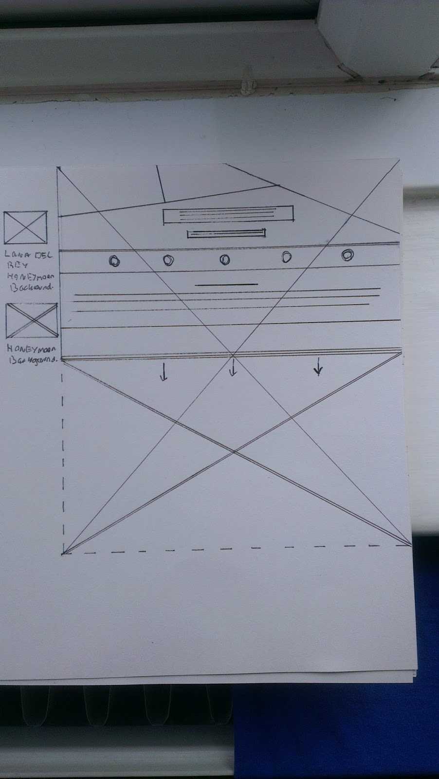

I tried making my wireframes as neat and professional as possible so when I come to create the digital version of the website it is easy and clear.
I took the wireframes and showed them to others to get a little feedback, Most people preferred the second wireframe design because it had more structure. I also thought the same so decided to g ahead with the second wireframe and begin adding the elects for a digital design.
Using the my keywords and the research I had carried out on new album release camping websites, I had an idea of what elects to dd to the webpages.
I narrowed it down to these main points:
Release Date
Videos
Social Media
Purchases
Merchandise
Photo Album
I began by building the design piece by piece using the typeface 'Armata' in the colour that contrasted and matched the alum cover.
During the development I kept in mind my keywords and tried to stick as closely to my idea as possible. As well as keeping a Lana Del Rey theme continuing.
For the background image of the website, I looked to my keywords and used my research to decide that a wide open space landscape image would suite the webpage best. Si I took some time to go and photograph a few different landscapes, when I collected a few decent images I returned and altered them, by colour and contrast to fi the style of the campaign.
Below are the finished deigns along with the desktop and mobile version of the website.


I am really happy with how the design has turned out, i feel it matches the style of modern camping websites I researched as well as the style of Lana Del Rey herself. I think my key wording definitely helped in the design of the website as it acted as a guide to the correct colour, shaping ad text use.


The website looks much more effective when placed in the desktop template


When applying the website to the mobile device, I opted for stripping the webpages and keeping only what was important to the user accessing the site through mobile.
No comments:
Post a Comment