Monday 24 October 2016

OUGD504 - Studio Brief 01 - Book Cover Style and design choice


Thinking about the style of my book cover, what my audience will look at first when they see the book. I have recently found it difficult to think of a way I can express the overall modernist theme of the book as well as expressing the images of London inside the book.

A lot of modernist designs that I have come across will usually opt for a thick card sometimes even thick gloss card for the cover which provides importance and protection to the books interior.

As for the cover design, after carrying out some research there are a lot of designs that use minimalist images and text to achieve an beautiful design with a message. I would like to apply the same design style to my book cover.

I came across a website which had a sm all collection of very modernist cover designs which perfectly matched the ideas which I had in my own mind. 

FlavorWire.com

http://flavorwire.com/292165/25-awesome-minimalist-book-covers/25


I really think these cover designs are just brilliant. They express so much information using so little effort. Some of the designs work so perfectly just by strategically placing either text or image together which then expresses the subject of the book. 

I also love the minimal colour use on each design, it allows for a very clean and easy to understand design which is essential for catching the attention of the books audience.

I also came across 'engraving' which is an option if the designer wants to use less ink and create a more 'perfect' feel and image for the book.

Below are a few more design which are created by engraving designs onto leather which interest me quite a lot.


I love the designs of this small collection, maybe not so much the ones the choice of colour for these designs but the intricate engraving is lovely, and could possibly be applied to my own book cover.

I also came across some engraving, this style shows the covers of each book which are cut into to make an image or pieces of text, these designs to me seem very modernistic. However the process looks extremely long and would probably take some practice to perfect but either way I love the designs. 


As for my final choice of cover design I feel I may try to practice my skills at engraving however I think I will opt for full ink use to display my images or text on the front cover of the book.

Friday 21 October 2016

OUGD504 - Studio Brief 01 - Book Design Evaluation


After researching into the world of scrapbooking and at the same time researching the modern style of photography books and similar designs I have decided that I will be taking a more modern approach to my own book design.

----------


The book will feature images of London from various different areas. the subject of the book will be aimed at tourists. Possibly to act as a small handbook filled with images that tourists will find during their stay in London. I feel that the slimline book will feature popular photos from around familiar areas close to the London city centre.
For people who are just looking for a small amount of essence of London then I think the insides pages of this book would be quite interesting to this people.


For then design of the, because there are not very any pages inside the book, I feel it will be seen as more of a handbook, something slimline that is easy to carry around in a bag. instead of something much bigger that would probably contain a lot more information rather than more images.

Below are some examples of how I imagine my design to look


However because I will be aiming for a more simplistic design the images above are good for an example of what they style of the book will be like but not the finished design. Looking back on earlier research I feel that sticking to pure white colour is best to achieve a minimalist design.

From this it would make it easy to build from when designing the engraved title. 


The cover of my book design was originally supposed to be gloss but because of lack of time I was unable to get the cover design printed onto gloss stock, So instead I had to opt for gloss paper which is not a reflective as gloss card and definitely not as defensive however it was the closest option I had.


The cover design In kept simplistic and similar to the designs above, which I feel is most effective to achieve a modern style. The image is of the London Eye, a very famous London landmark which I thought would make a nice touch to the cover. Overall the design of the book is quite thin because of the amount of pages, which does make the book seem less heavy but the positives are that It will pass as a handbook design.


Wednesday 19 October 2016

OUGD504 - Studio Brief 01 - Modern/simplistic book cover and Binding methods


I want to explore the latest ideas of modern book covering and binding. If i compare modern book covering to a type of covering that would be used in scrapbook making, then I would imagine the covering of a scrapbook to be very hardwearing, able to take damage and still look and feel like it would still be intact. Scrapbook covers are made to last longer compared to more modern covering designs which are much more perfected to look 'presentable' and are finer. Most of the more modern designs of books that I have looked at recently will either go for the sturdy hardback front and back cover with design over the top, or a very glossy thinner card which can sometimes be folded for extra strength or left as they are. 

If i were to go ahead and design something similar to these designs, then I would have a very good feeling that my design would be based on thick gloss card which would probably be folded for extra strength to protect the book. I first want to research why gloss would be a good choice for my book cover. 
I came across a website the explores the differences between a none classy matte finish and a gloss finish, the discussion was about what would look best on a book cover. 

Here is the website 
http://www.bnbindery.com/news-marquee/2016/2/3/matte-vs-gloss-soft-cover-lamination-which-is-right-for-your-book


The post talks a lot about how gloss is a much more attractive type of covering to use for a book, and looking from a few different images I would definitely have to agree that gloss is a much more presentable covering to use.

'Gloss laminate is visually stunning.  It produces deeper, cleaner and crisper lines and colors, and gives vibrancy to cover photos.  The glossy, reflective finish grabs attention and implies a richer product. Gloss laminate is durable in that it repels dust, dirt and fingerprints.  Even when it does come into contact with surface dirt, it is easily wiped clean. Gloss is the standard for trade paperbacks.
Some considerations to make when choosing gloss lamination: Scuffs, scratches and indents can be more visible with gloss covers - by nature of the glossy reflective finish, the imperfections catch light and draw attention. The vibrancy of color and sheen of the finish can sometimes overshadow the subtlety of an understated cover design.'


The above piece of text is taken from the website displayed above,

It talks about the pros and cons of using gloss and a covering. it is a visually stunning technique to use, however because the effect is delicate, any damage will be shown up easily which would be quite worrying as I wouldn't want the finished product to be damaged any way. 

I found a book within the college library which I thought was quite a perfect example of the kind of style I would aim for if I went down this design route.


I love the style of this book, the way the cover has been created and the glossy style of the cover just makes the colourful images on the front jump out. It really works with modern folding techniques and definitely gives the book a professional feel to it. I would definitely take the covering technique of this book with me to own possible creation.

The Binding method is also something else I will need to think about when creating my own book. This book above is perfect bound, a fairly simple sturdy way to bind books that use a lot of pages. It deftly works for this book and ads to the minimalist overall design. The stock through the  book, it thin card and the pages are matte, which makes images and text easy to see with to reflective light. 


Monday 17 October 2016

OUGD504 - Studio Brief 01 - Modern Photography book designs


My other idea for this project is to create a more modern photography book design. A book where whole double spread pages are dedicated to one whole image and no text. Each page in the book could be different containing both image and text in a very minimalist and perfect form.

I have spent a bit of time researching some magazines and books which are very relevant to my own possible modern book design. 
I loved the design within the pages of these books.


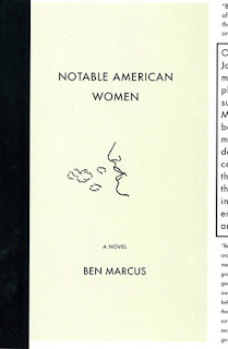
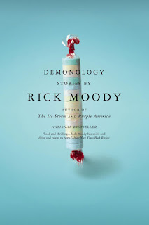
I love the designs of both of the book covers, the modernists designs really work with the ideas I have in my mind for my own designs. I favourite is definitely the left design, the whole use of the image which fills the entire cover, then any text such as the title and bar code is placed over the top in the correct places to make use off the full image. 

I usually use minimal colour when it comes to more simplistic designs of work. where as the design in the left gives me a lot of confidence that I can create something very modern whilst using full colour images.


This book cover design I definitely love, mostly because the cover has been made using card, yet the over all image of the book is really effective. the simple use of black for the cover image it probably my favourite part, I will definitely think about taking this design forward with my own.


Overall, the designs above is the style that I definitely will take forward if I choose to design a much more modern style photography book, the reason being is that the layouts above present a lot of order. 


§§§§§§§§§§§