Tuesday, 1 March 2016

OUGD503 - Responsive - Secret 7 - Development


After carrying out my research and a little photography I was able to begin working on my cover sleeve design. 

I wanted to keep the design interesting yet simple. I wanted there to be a lot negative space on my design so to give all the attention the the image that I produce.
I started by importing the images of trees and branches that I had thought would be effective for the design. Below is my favourite image.


I loved how the image of this tree matched so closely to that dark theme of the song and the environment that was in the music video. I thought it would be the best image to use and edit long with my researched colours, blue and silver.

I altered the image constantly over and over, whilst exploring with different shades of blue and grey/silver. Below are a few practice designs that I created during the experimentation. I wanted a very perfect image of a tree so I altered the image to make the tree more balanced. I then used the brush preset tool to transform the section of the image I required into a brush I could use endlessly. this was really useful because it made the process of making changes, adding and taking away elements a lot easier. It also gave me the ability to experiment with different shades of blue without any confusion.


I liked these designs for an album cover however I felt that they were too weak to use as design for the song.
I took these designs to peers for some feedback. The feedback i received was quite mixed, I was told that the designs were very tranquil but were maybe a little too simple and needed to be more interesting. I also received comments on the colour use within the design, I received a comment to increase the colour in the design. Since I wanted to use the colours blue and silver, the designs above seemed to be lacking in those colours.

I continued with the design, and decided to emphasise the image of the tree by mixing it with more blue.


I had the idea of overlapping to achieve this, the technique of overlapping let me emphasise the amount of colour I could use on the single image whilst keeping the design simple and neat. I wanted to communicate the style of the song and the song name into the design.

I am really happy with how the design came out for 'clearest blue', I really wanted to give attention the the theme of the song and communicate the word 'blue' and 'clear' Also i tried to incorporate the nature of my key words into the style to achieve something expressive.
However I feel that if I had more time to experiment with the design, I would have liked to have used more shaded of blue and maybe experiment with more new brush creations.

OUGD503 - Responsive - Secret 7 - Brief and Ideas


For my next project, I will be designing an album cover for the secret 7 competition brief. I will choose a song from 7 pre selected tracks, each song a different genre and artist. I participated in the 2015 secret 7 competition brief which I really enjoyed, so I am excited to create something new and better for this years selection.

The tracks to choose from are:

CHVRCHES - Clearest Blue
Eta James - At Last
Jack Garrett - Worry
The Jam - Art School
John Lennon - Imagine
Max Ritcher - Dream 3
Tame Impala - The Less I Know The Better

After listening to each track my favourite was Clearest Blue by CHVRCHES. I really liked the style and sound of the song.

I found out that the song had a music video on youtube, So to get a better idea of what the song was about I spent a few minutes to take a look. The music video was very dark themed. The video presented the singer dressing in armour walking through dark woodland during the night, until the song gradually came to the synth pop sound explosion at the end which saw her dancing in a club with alcohol.
I did have some trouble understanding the video but I really like both the song and the video so I am excited to start working on some designs for the album cover.

CHVRCHES - Clearest Blue


I decided to re watch the video and write down words that I think best describe the video and the sound of the song. Then at the end I will be able to use these key words to help me design something perfect for the cover.

The key words I wrote down from the song an video are

Dark
Pop
Sounds
Light
Confusing
Nature
Silver
Armour
Black
Blue
Steel
Soft
Dance
Beat
Catchy
Fun
Shocking

These words describe how I felt when listening to the song and watching the video, so I will use them to help me with my design.

After collecting some keywords, I really want to create something using the colours silver and blue, so to match the name of the song and the lyrics in the song, also the video displayed a lot of silver so I really want to use that along with the blue.

There are a lot of synthetic pop/dance sounds in the song which give me the feeling of 'imperfection' possibly things and objects that are not perfect. The lyrics in the song are quite interesting and have a dark tone to them so I could possibly use an image that is quite organic or somehow connects to nature, (trees, Branches, dead foliage). I think they would be quite effective elements. 
On the cover design would like to use an image or image of an object that holds the main attention and explanation of the song. I want to use something that relates to the dance and pop feelings that are created by the song. 

I first plan to go out into the woodland that is close by where I live and take a few photos that I could possibly use for my design.

OUGD503 - Penguin Random House Design Award - Submission


After altering the size of my finished book cover I was finally able to submit my design to the penguin random house brief. I was a little nervous about submitting my design because I am sure there would be thousands of other designs to compete against. 

However I am really pleased with how my design turned out, I feel that I have communicated the storyline of A Clockwork Orange effectively through my idea and design, I hope that the judges like my design.


Tuesday, 16 February 2016

OUGD503 - YCN brief - WRAP Recycling campaign - Research


To start of my research I took the objective from the YCN website and created a questionnaire which I will spread across my social media. 

I have used SurveyMonekey.com to create the small survey, since this allows me to lightly edit how the survey looks. The questions I have asked will hopefully get feedback which I will be able to use to communicate an inspirational campaign towards getting student to become more familiar with recycling.

The questions I have asked are mostly relevant the the student lifestyle, as I am a student myself it was a little difficult trying to look at the questions from a different perspective. However I feel I have arranged questions that connect the idea of recycling to the busy student lifestyle. 


Sunday, 7 February 2016

OUGD505 - Study Task 01


In today's lesson, I looked at how artists work can be copied, used an manipulated by other artists over time. Popular pieces of art work created by well knows artists are used as the base of other new artists or designers to express their own artistic style by manipulating another's successful work.

In the session I looked at popular pieces of art work that had been created over time and then how other more new artists had taken that art work and made something of their own. What was good about this session was that the images were used as a test to see how well we would be able to find the difference between the true creator of the popular art and the re creation that was made by a later artist. After practicing this I then moved on to creating my own piece of work.

However for this I had to use objects and elements that I could find around me to crete something where I could express myself in what ever image I wanted.
So I went around the college with a few friends to locate different objects such as magazines, newspapers and various prints which contained images that were appealing to myself. I then used these and expressed myself by taking different images and placing them together to create something new.


Since this was a quick exercise, I just took what images I liked and tried to make something appealing from it. The idea of my collage is to express 'mood' starting from the left the mood is negative which I tried tho express through the use of dark and desaturated images. Then travelling to the left of my work I faded in more vibrant images and colour to express positivity. Then in the centre of my work I used images of facial expression and matched them to the colour which I expressed behind them.

I enjoyed this exercise because it gave me the chance to practice something that was not digitally created which is different for me since I am a graphic designer. It allowed me to express myself in a different style.
  

Wednesday, 27 January 2016

OUGD503 - YCN brief - WRAP Recycling campaign - Brief


Looking through the advertised briefs on the YCN website I came across a company called WRAP who are looking for designers to create a campaign which will inspire and motivate university students to recycle.

WRAP gives extensive information and reason into why the creation of the campaign would be beneficial. The brief explains that university students make up a large part of the population within the UK, yet the idea of recycling and the reason for it is not effectively part of many student lifestyles. 
The idea is to create a campaign which will become the solution to that and will inspire students to engage and become more familiar with recycling.


The campaign is very interesting to myself since I am a student and admit that recycling is rarely the first thing in my own mind. I feel that exploring and creating a campaign for this brief will help me to understand more about the benefits for recycling and at the same time this gives me a chance to influence people at my university about the benefits of recycling. I will also use this opportunity to promote my own style of work and design.

When reading through the brief, there were a few points in which WRAP would like me to start with first. 

Firstly I will carry out some audience research, for this I plan to use a survey and spread it across my social media.

Then I will think of a concept for recycling inspiration.

I will then work on a campaign name and think of some imagery that will effectively communicate and image for my the campaign. 

Hopefully by then I will have an overall message that I want to communicate through my work.

I will try to provide explanations and justifications into why I have created chosen imagery and chosen message.

After designing and creating I will work on a communications plan, so I will be able to find effective ways to roll out the campaign across my uni.

I want to take into account a combination of media platforms and ways of communication such as social media, PR, Print and the web. 

i then hope to receive feedback on my campaign


Friday, 8 January 2016

OUGD504 - Studio Brief 03 - Final Design


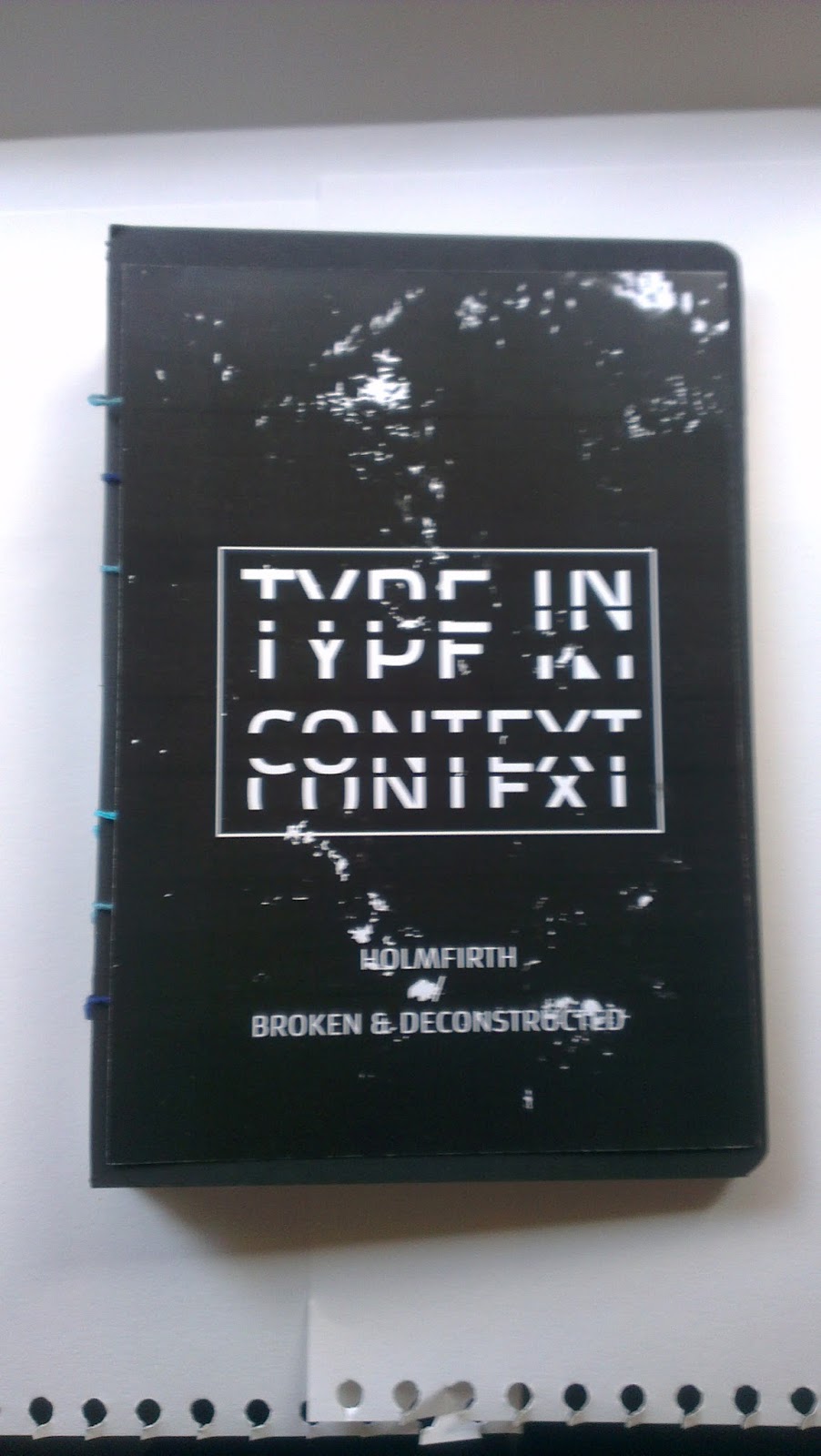
After completing my digital version of my book I was ready to print and bind.


I am very pleased with how the digital design turned out, i think I mange to produce a professional lofkingpublication and I feel s though I have expressed the title page through the book with the images and editing.


I then applied the printed pages to the front and back cover of my book and then used my chosen bonding method 'single colour page binding' To complete the finished product, below are a few images.


I am very happy with the end result however the binding method which I chose was very time consuming and stressful and I would pebbly opt in for using a more simpler binding method next time. however the bonding result turned out great and I am really happy with how the binding changes and effect the look of the book ever all.