Monday, 19 June 2017

OUGD505 - SB02 - Development and Final designs


After carrying out research into art method of Russian Constructivism, The issues in Chechnya and research into design that inspires and informs I have managed to work on and complete a series of posters which I feel really represent Chechnya in a new and fresh way whilst also having the ability to inform people of the issues currently taking place.

The first design expresses method of Russian Constructivism in it's strongest form.


I really love how this design has turned out, it is definitely one of my favorites. I have really tried to use the power of contradiction to give this design an edge. By incorporating a manipulated image of the Chechnya's leader in a style layout which would seem he is supporting gay people rather than abusing and killing them along with A Russian design method and my choice in caption really makes for a design which I at a personal level would be happy to represent myself.


The second poster design of this series has a lighter use of Russian Constructivism and instead expresses a much more emotional design, one which emulates the 'idea' in which I imagine the victims of homophobic abuse in Chechnya to feel and using empathy to imagine how I would feel if it was myself going through the same issues which thankfully I am not.


The final design is uch different to the first two, mostly because it focuses on the use of text rather than the use iof image to express a message. I have design this poster by manipulating tect to represnt cage bars. These cage bars in essnce express the current state of the country, and what The coun try of Chechnya actuallt feels like to a lot of gay en who have no escape and must suffer with the constant fear of being abused. I kept this desdign black and white becvause I rerally wnated to draw attention towards the avtual text and the image in creates and expresses. I think it is really important to see Checnya as it is.. A prsion for many thousands of people.


Monday, 12 June 2017

OUGD505 - SB01 - Leeds Indie Food Festival digital design


After experimenting with different typefaces and images, I feel that I have completed the digital poster design for this studio brief. I am pretty excited to take my design to the next stage which will be screen printing in gold and silver. 

I have created the design with simplicity and having the ability to draw attention to the design in mind. 


I feel that I have created something which expresses a different style from my usual outcomes. 

Mostly because I have tried to revolve the design around the word 'Indie', creating something more individual and different to what you would normally expect to see. the best part of the design I think is the onion in the middle, I think an onion is such a simple thing, a vegetable that is used in so many 100's and 100's of dishes and meals, and for that reason, I think it is the best piece of biological matter to represent this poster.

I will now be taking this design to the next stage which is screen printing.


Saturday, 20 May 2017

OUGD505 - SB02 - Research - Designs that inform and inspire


I believe that it is important, with a subject like the current situation in Chechnya for responsive designs to be able to inspire and inform people about what is happening.

What really makes a design informative and inspiring?

I decided to do a little research


I have found a lot of amazing examples of inspiring and informative poster designs online, all with different subjects and messages, but each has an extremely innovative design.


I liked this design because of how the subject and images contrast with the colors that are being used. Because of the cool blues, the white icons and text are very visible and noticeable.

I really love this design, I instantly feel a sense of calmness just from looking at it. It's such a minimalist design yet you can tell straight away that it is bringing attention to forests and nature.


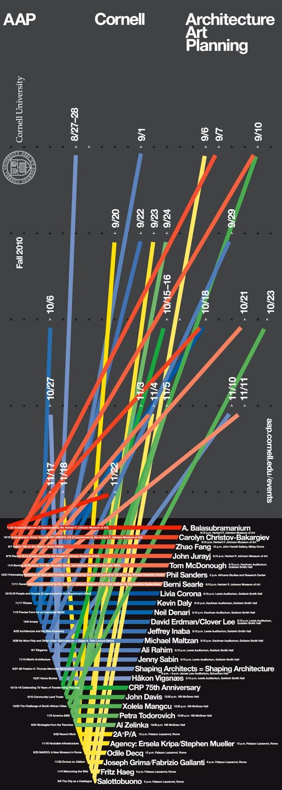
I believe this design has something to do with architecture, however, the design is fairly beautiful, not as simplistic but the use of color and crossing lines is very effective and eye catching. It shows to be representing data in a very colorful way.


I instantly thought 'this design is ace', the message alone is credible and the flowing lines that make up the phrase just ooze's inspiration.


This poster design is definitely one of the most inspiring that I have come across, It is representing how speech has the ability to end and prevent wars/violence. However, by keeping the color use neutral, and combining images which not only represent objects of war but also objects of speech, it makes for an extremely effective design which can inspire thousands of people.


I like this design because of the beautiful, articulated text and line use. It is a very beautiful design which I believe would work well with any color in the spectrum. 


Effective, inspiring and simplistic 


As a lover of good coffee, I downloaded these designs as soon as I saw it. I just think it's brilliant. Clearly, a scale to show the levels and strengths of coffee bean roasting. The designs and the colors which mimic the exact color of coffee which the beans produce are beautiful and make for very informative pieces of art.


Another brilliant simplistic design. I favor towards the message mostly, however, the style of design is fairly inspiring and expresses a personal theme.


I really love this piece. The subject is 'The oldest trees in the world'. I absolutely love how graphic design has been used to identify the age, location, and types of trees on our planet. All within a pastel dark green background which draws the most attention to the informative design.


Clean, modern and the colors are fairly effective.

All together I am really keen on all of the above designs, as it shows how effective, cleverly graphic design can be when it comes to informing and inspiring.

I feel that this kind of creativity ca definitely be applied to my graphic response to the issues in Chechnya.

OUGD505 - SB02 - Further research in Chenchya


Carrying in my research into the events in Chechnya.

Research and news reports show that Chechnya's rulers deny the alleged abuse towards gay people in the country. However, a recent report which I have found shows that gay men are seeking refuge in other countries because they are scared of the what is happening to other gay men in Chechnya. I believe that if there really was not such a situation taking place like the ruler stated then gay men would not be fleeing to other countries to try for safety.

http://www.bbc.co.uk/news/world-europe-39974512


There are currently 5 countries in the world who are offering support to gay men in Russia.

One of the countries has stated that by doing this and helping these men, they are also sending a message to Russia, 'we are helping your citizens who's rights have been abused'.


OUGD505 - SB02 - Research into Homophobic abuse in Chechnya


The first piece of information I have come across about Chechnya is a website which had created a petition on the subject of killings and abuse of gay people.


https://www.amnesty.org.uk/actions/stop-abducting-and-killing-gay-men-chechnya

Below is a section of tex from the website which confiorms that people are being tortured and killed for being gay.


The point of this website seems to be about using politics, public awareness and law enfocment to fight back against the death abd abuse to innocent people. 
This shows that public action is already being taken on a global scale, which I think is very important to this subject. 

/////////////////////////

The next piece of infomation which I came across is on a subject which links to protest action against Chenchya. Gay activists arrived in chenchya to deilver ant protest infomation and posters, until the gay rights activists were detaioned and arrested by Chenchya police for participating in 'unauthorisd action'. Meaning that the information thast tjey were delivering did not even make it to it's oplanned destination. 


http://www.bbc.co.uk/news/world-europe-39881452

A video of the inccident was posted by 'BBC news'. 
Here you can basically see the enterity of events.

///////////////////////////

The next piece of information which I have come across focuses more on the subject of 
gay people in Chenchya who are attmpting to flee the country and the continued abuse. This report is quite shocking as it talks about the US denying visa's to these men, meaning they are unable to leave the country. 

Which is quite a shocking report as so many western countries, including the US have stated how 'disgusted' they are about the events in Chenchya, so it does not really make sense that the US are denying these men access to the country.

http://www.independent.co.uk/news/world/americas/chechnya-gay-men-us-visas-denied-trump-government-crackdown-flee-536-a7741901.html


//////////////////////////


Wednesday, 3 May 2017

OUGD505 - SB01 - Gold and Silver print research


After I have completed the digital version of my poster design for this studio I brief I will be taking the design to be screen printed so I can submitt the design as a traditional piece. 

I have been thinking a lot about the colour of which to print in. I feel that this poster design should be something special which is why I want to try printing in the colors gold and silver. Which would make for a very metallic and regal effect. 

But before I go ahead with thar design idea, I want to reserach a little but into what makes the use of gold and silver together so interesting.


The first thing that springs to mind is the new british £1 coin, which has been designed using gold and silver metals.


I think that new design and the addition of the silver to gold makes for a very beautiful piece of currency. plus the actual design of the coin which crosses from the silver into the gold enhances the metallic color even more.

Now I want to move into some actual poster and publication designs which have experimented and perfectly executed the use of gold and silver.


I would say that the COCO CHANEL piece is probably my favourite from this small collection, just because the actual image and outlines have mostly been created using gold colour. I feel that the design just comes across so regal and modern, it is highly effective and pleasing to the eye. 


https://uk.pinterest.com/pin/377106168777926664/


Overall, looking at my small cllection here, I feel very confident about how my poster design will look if I apply the same design style during the screen pronting process. 


Tuesday, 2 May 2017

OUGD505 - SB01 - Leeds Indie Food Festival designs


Before starting on my own designs I think it would be a good idea to research some of what Leeds indie food has already produced in terms of publicity and design.

I think it would be a good idea to understand the style of design that they have chosen before creating my own version.

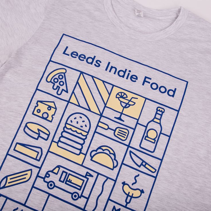
I already have a good idea that Leeds Indie food festival have opted for a more illustartive and perosnal style.


This design, above is the general style of the festival, it aslo matches the design of the website also.

I feel thst the design is very effecteive, however I feel that it would be possible to make an even stronger design uising, possibly more bold colours or even opting for black and white.