Friday, 8 January 2016

OUGD504 - Studio Brief 04 - Development/Final Designs - Digital Creation


Now that I know what I wanted to create and what kind of style I wanted to go for, I looked back at my research again to get a better idea of what would work best, what would male the fans become more inclined to visit the website more than once.

I made the decision to not go forward with my sketched but instead recreate some more designs that would fit a modernistic style, closer the the ones that are used today of other artists and their campaign websites. 
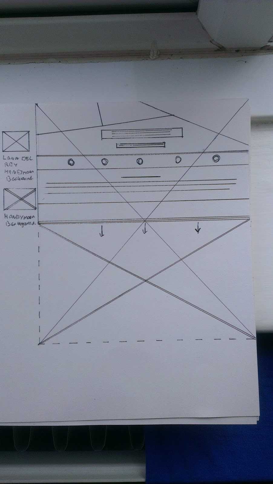


I tried making my wireframes as neat and professional as possible so when I come to create the digital version of the website it is easy and clear. 

I took the wireframes and showed them to others to get a little feedback, Most people preferred the second wireframe design because it had more structure. I also thought the same so decided to g ahead with the second wireframe and begin adding the elects for a digital design.

Using the my keywords and the research I had carried out on new album release camping websites, I had an idea of what elects to dd to the webpages.

I narrowed it down to these main points:

Release Date
Videos
Social Media
Purchases
Merchandise
Photo Album

I began by building the design piece by piece using the typeface 'Armata' in the colour that contrasted and matched the alum cover.
During the development I kept in mind my keywords and tried to stick as closely to my idea as possible. As well as keeping a Lana Del Rey theme continuing.

For the background image of the website, I looked to my keywords and used my research to decide that a wide open space landscape image would suite the webpage best. Si I took some time to go and photograph a few different landscapes, when I collected a few decent images I returned and altered them, by colour and contrast to fi the style of the campaign.

Below are the finished deigns along with the desktop and mobile version of the website.


I am really happy with how the design has turned out, i feel it matches the style of modern camping websites I researched as well as the style of Lana Del Rey herself. I think my key wording definitely helped in the design of the website as it acted as a guide to the correct colour, shaping ad text use.


The website looks  much more effective when placed in the desktop template


When applying the website to the mobile device, I opted for stripping the webpages and keeping only what was important to the user accessing the site through mobile.

Thursday, 7 January 2016

OUGD504 - Studio Brief 04 - Development


For the design of the campaign website, after carrying out research on Lana Del Rey and various artists, including their own websites and album release campaigns. It gave me ideas for the style I wanted to create for Lana's album release campaign.

Since I have already listened to the whole album I understand the meaning of the songs and the style that is has been created in, The whole album is based on life events and the style of the music and lana's voice is very light yet deep, as well as creating a feeling of very passive behaviour.
Combining this to that artists style and image I begin to build ideas of the design I want to create for the website.

As I went along I wrote down random key words 

Light
Air
Passive
Sharp
Colour
Black
White 
Sleep
Clarity
New
Real
Clear
Smoke
Confusion
Darkness

These key words are useful because it will help me to build an image based on the artists.

I definitely want to focus on the idea of light and darkness for this design as well as the idea of this being something as a source of newness and clarity since that is what the album seems to be about for the artist.

I made a couple of sketches, The style that I want to base the website on.


The idea I want to apply is for the website to have a new and modern take on design. The website will be broken into pieces and each section could be dedicated to different pieces of information that the artist will want fans to know about the new album release, such as purchases, tour dates, merchandise and social media including conversations. All things that I collected from my research into campaign websites.

Since I will need to apply images to this idea of a website page being 'broken' up into sections, I intend on working with the style and image that is expressed through the album songs. So wide open spaces, nature, abstract images, possibly images that make the viewer confused yet interested and baffled.

I also base this idea on music videos that Lana has created for some of her songs.

Lana Del Rey - High by the Beach


This is a perfect song to base my idea from, the idea links too all my key words and ideas for image creation. The song also happens to be the leading single within the new album release, so I will also concentrate some of the publicity to this certain song as well as the entire album.

The style of music and style of videos including the image of Lana Del Rey herself for this era of her new album 'HoneyMoon' all connects to the keywords I collected above which I will help to use to build the website image and campaign.


I will now begin to digitally create my ideas to get a cleaner idea of what the campaign website will look like.


OUGD504 - Studio Brief 04 - Wireframes Research


Before designing my own campaign website for desktop and mobile I would need to create wire frames.
Wireframes are basically like the blueprint for a website.

It makes the building and structure of a website much easier and simpler to edit.

I want to carry out some research into wireframes so I understand it a little more.

I came across a website called webdesign.tutsplus.com 
This website gives an extensive guide into wireframes with images with his they are applied and used. The guide is mainly for beginners and teaches how to design and use low quality wire framing up to high quality wire framing. 


This shows wire framing at a very simple form, the guid explained how to go from step to step adding more elements to the wireframes.


When the basics of the wire framing is complete, the actual images and text can then be applied.


 This shows basic wire framing for a desktop website. The wireframes are preset to make editing easier.
The website goes onto explain how wire framing can be built up and up until it becomes more complicated

These images definitely give me a better sense of how wire framing works and how it is used to build a website. I will use this t start by hand rendering my own wireframes for my campaign website.


Wednesday, 6 January 2016

OUGD504 - Studio Brief 04 - Research - Lana Del Rey


For this I will first be creating wireframes for my camping website, desktop and mobile version.

However I will start by carrying out more research into my favourite artist Lana Del Rey and since this is a campaign website project I will research into other various and similar artists to build up ideas for my designs.

Firstly I went to take a look at Lana Del Rey's current website 


Her current website is very effective and up to date with the latest website styles. it is clean strait forward and simple. Everything seems to be accessible from the very start of her career up until present.

Since I am a fan of Lana and her work I know that her work and overall image is somewhat passive and faint. She is an individual meaning there really is no similar artist to her which is what makes her unique. Lana sings mostly about her life and experiences which have always made it easy for me to connect to her music. 

Her overall image has always seemed to be a dark beauty, and it is expressed through her music, modelling career and artwork.

Already I have ideas for the campaign work I will be creating.


A similar artist is 
Troye Sivan


His official website below


Troy's website is very similar to Lana's, very clean and simple with a scrolling style to the website meaning everything is instantly accessible. The colour use, image and shape use on the website is themed the same style of his work which is very effective.

All of the artists work seems to be on display which instantly promotes every aspect of his musical and social career which again was ver similar to lana's.

Troy uses his website as a platform for social media and music release. Since the singer has only just released his first album the website seems to mainly promote that. The website displays the option to buy the album including offers. Music videos of newly released songs on the album are on the screen instantly ready to watch. Also the website is used for merchandise from the artist. The websites current purpose seems to be promoting the release of his first studio album by using theses tools.


Katy Perry


I love the design of katy's website, it's very clean and light and just like the previous websites, has the same easy to access scroll down style. The album is a window to her social media, world tour dates, videos and latest album release. it is perfect for promotion purposes and gives a way for fans to connect with her.


Selena Gomez


This website is quite different to the previous, the web page is much more crowded and there is a lot more information being advertised. The website does the same as the previous and uses the site as a window for social media and seller's latest album release (which is amazing..) however instead of a simplistic website design the webpage seems more like a blog, making it more impactful and interactive than the previous as there is more on the web page that viewers can see and use to connect with the artist more. 

I wouldn't say this is my favourite website design but it is definitely the most effective in tarring information to fans.


These websites are very successful in what they are trying to achieve and are very effective. not only do the websites serve multiple purposes but they express the individuality of the artist through colour, image and text.

These websites already give me ideas for what I want to do with my own campaign website. The modern style of website with clear windows really gives me inspiration as to how I will not only promote Lana's latest album but express personality through the website also.

OUGD504 - Studio Brief 04 - Brief/Research


For this brief I will be creating an immersive and engaging campaign website to support the release of my artist’s latest album.

The artist that I will create campaign work for is Lana Del Rey and the album name is 'HoneyMoon'

The purpose of creating this campaign website for Lana Del Rey's latest album is to make a connection between her and the public/fans and to increase sales and promotion.


Lana Del Rey
(Elizabeth Woolridge Grant)

Lana del rey is an American singer/song writer and model with global successful albums and a producer of 'indie' style music.

Her genres are Baroque, dream pop, Rock and Trip Hop

Her instruments are Guitar, Vocals and keyboard

Lana became known around 2005 and has been active until present

https://en.wikipedia.org/wiki/Lana_Del_Rey#Career

and her official website www.lanadelrey.com 


Her latest 5th studio album is 'Honeymoon' released in late 2015 

I am excited to create campaign work for 'Honeymoon' as I have always been a huge follower of Lana Del Rey and her work. Her music is inspirational for me and it is something I have always been able to connect to.

This makes this project my favourite out of the module and I am excited to start applying my own ideas to her new album campaign.


OUGD504 - Studio Brief 03 - Development


After carrying out extensive research I felt ready to begin my own publication. 

'Type In Context
Broken & Deconstructed' 

I first started by choosing the best images from the collection, ones which have more of a story and would pick up interest, Images that were not so effective would not be in the publication.

I then began adding the images to the digital book pages, after taking in the research I had a good idea of how to display the images in the book.
To create something modern yet distorted, I would need to deconstruct the images and alter them. Similar to some of the designs I looked during research I experimented breaking the images up into sections and working with mostly black and white. 
The image would then take up most of the page to break the boundaries and make the most impact to the reader.

Then moving onto the text working in the most effective font 'Armata' I used a simple grid method to structure the text and names of the images.

Below is a double page spread sample, this is what the finished pages should look like:


Then I began by designing the cover of the book, I wanted to create something that matched the style of my images. The images that I collected were all very different and personal to who ever had designed the contents. Some of the images were urban, some were simplistic, some were regal and a couple were not that common.

For this project I wanted to again concentrate on a theme of black and white, Which would be most effective for the project taking into consideration the style of the images and the binding choice. 
I first experimented by using one of the images as the book cover background but found that this gave an over complicated look when applying text over the top. I then decided to go for a pure black background and began altering the text 'Type in Context' instead. The text would be in white to contrast with the black background. The text would be in the font 'armata', which I would then distort and break into a sign that is much more effective.

Below is the finished cover design 


I created a spray effect in the background to match the theme of the book. Also I broke apart the title and then altered the positioning to make an abstract design, yet still readable. The book cover is in the style which matches the images and construction with in the book. 

I am happy with the style of the cover and the display of pages within the book, so I will continue to work in the same style for the rest of the pages. I feel that my chosen binding method will work well with this design.


Tuesday, 1 December 2015

OUGD503 - Penguin Random House Design Award - Development/Final Design


After carrying out research on the original design work and advertisement on 'A Clockwork Orange', then collecting words that described the 'odd' movie and researching similar book cover designs that matched those keywords. 

I then began working on my own design.

First I thought of a concept that would communicate the essence of the movie. My key words:

Dark
Old Fashioned
Psychological
Dark empty sounds
Dark music
Slapstick comedy
Dark Humour
Narrative
Sadism

These words created some sort of distorted image in my mind, something good that could possibly be damaged. At the same time I needed to create something that would fit in with the level of design in book cover's around today. 

I wanted to make something individual and clear so when a reader looks at the design, they instantly have an idea what the genre of the book is.
After I watched the advert for the movie I got a sense of 'dark humour mixed with dark psychological behaviour'. So I began thinking of images that related to this, until the idea of using a simple smiley face as the main point of interest on the book cover.

Then moving onto ways to relate this to the dark humour and psychological behaviour of the movie. I thought of hand drawing the image in fine pen as if to give the idea of a 'message' which definitely relates to this whole dark theme. The idea of a big impact with little care was what was needed. 

.......


Then I needed something to make a statement about the image, so having the idea to tear the image up once it had been created then placing each piece of the image back together to create this 'distorted image'. This was to increase the effectiveness the image had when representing 'A Clockwork Orange'. 

Then using various editing tools I was able to manipulate the image to achieve a better suited look. Basing the design on the research carried out on effective book cover designs using black and white, It became easier to manipulate the image to to something that was similar to the effective book cover designs. 
Then achieving the perfect look with the image, where the the hand drawing was a sharp and bright white against the black and dark grey background almost gave the drawing torn open look that was somehow being invaded by light, this produced a very effective image which worked well with the the dark genre of Clockwork Orange. 


When the image was complete it became easier to work on the positioning and style of the copy text which needed to be placed on both the front and back of the cover including the spine.

When choosing a style of font, it was obvious that because of the design method and general look of the front cover. The text would need to fit in with that somehow.
I had the idea to use a clear font for the 'informational sections of text' and then for the name of the book 'A Clockwork Orange', something which matched the design of the image.

As more cover copy went on the book the overall design began to look more professional and detailed. It became a little tricky when finding good positions to place the required copy because of the harsh black and white contrast in the image made it difficult to find a colour and typeface that wouldn't become lost. 
However the best colour turned out to be 'Orange' which worked well with the title of the book and also worked well with the nature of the image. 
It became clear after a while that to use text on an image like this, the text would have to work within the image instead of finding someway to avoid it.
When finding a suitable background for the back cover of the book, the best option seemed to be carrying on with the same image, however changing it to the opposite emotion 'A sad face' personally makes opened design a lot more interesting and thought out.

I then took my finished design to the module leader to get feedback.
The feedback I received was good, although I received a few comments on the text on the back cover which was hard to read, so I received some help with positioning and colour. We kept altering and moving the text until the perfect layout was achieved.

I then once again finalised the design and then took it to a few other students on the group for some final feedback. The feedback I received was positive.

I could then scale the image and display an image:


The overall design I feel is a success, even though it became hard finding good placement for the text to fit along side the image, I found that making the text work with the image turned out quite successful.