Saturday, 21 April 2018

OUGD505 - SB02 - Milk Carton Design research


Before creating design ideas for my repsonse to this project, I wnated to research some various Milk Carton Designs first. 

I believe that iver time I have seen some amazing, innovative designs printed onto the medium of a milk carton, My favourite out of all being this example below.


A Graphic Designers CV printed onto a milk carton..
Which I think it amazing and I would be massively surprised if he didnt get the job he was applying for with this thing. What I find most inspirational about this, is that the design and style of a typical milk carton is kept, he sort of uses that as a guide as to wear to put i formation about himself for the employer to read, apart from that it is very beautiful to look at bcause of the use of vivid colours.

Below I have listed some more examples that I found very isnpiring and idea engaging.


I liked this design for the simplicity, the colour use is minimal, I love the teal green against the black, it looks very proffesional and tranquil. The use of boxes around the text seems to bring a sense of order to the design which I think it was the designer was goung for. That I also like.


The design above is one of my favourites, Just the use of colour for each type of milk really makes the oevr all designs. I like how the cold use of colour shows which type of milk someone is buying. It resembles the same use of colour that you see on plastic milk bottles in the supermarket,  but the designer here has taken it to a whole new level. 

This design is a lot more illustrated and delciate, mostly because of the joice in typeface. Also the use of an earthy tone for the colour really works on a milk carton and it seems to work very well against the text and the cute image of the cow. The typoeface chocie is a good one, as I believe the text is making some kind of statemnent, I feel that it works very well.


I'v seen cravendale in the supermarkests, although i've never come acrosss this design before. I like the order, simplsicty and the slight touch of colour on each type of milk bottle. I also like hpw the designer has goven the cow som sort of humanised personality, with the wi nking of one eye and the straw in his mouth drinking the milk.


I don't believ that these cartons above are actually miulk cartons however they look very similar. These are juice cartons and I absolutely love them due to the spaciousness the designs seem to display between the images and the text. I like the simple use of pastel based colour also which gives a very nuetral feel to the design.


I beloiev the design above doesn't need an explanation.


These designs are awsome. By far one of my favourites, They look so modern and sleek, and I would feel quite proud picking one of these up in the supermarket, The use of colour makes the design, especially the light blue, the whole deisgn is colured on one colour which I love. I think the simplicity really works well.


Definitely my number one favourite, mostly because of the use of black against white. The obscure glass of milk design onj the front of each is very clever and modernised, not just that but the name 'LACTO' has something to it which draws you in. The design in general is very simpliostioc and beaituful and quite different to what I have seen so far.


Again another more simple design, very delicatley presented and the softer colour tones really help the fact that this is a bottle of milk, yet the designer seems to have gone for a more strigjt forward layout. Which can be very pleasing to the eye.

These designs are amazing, the use of colour and shapes I like but it's the actualy shape of the packaging that I love, it's very geometric and unexpected and I feel like it breaks the bounderies of the expectations that msot people have when it comes to how packaging should look. I can imagine the prices of these bottles of milk to be fairly high..


I believe that the design above is some sort of experiment, at using the shape of a milk boittle to present a design instead of a flat piece of paper.


Monday, 12 March 2018

(Repeat Year) OUGD505 - Studio Brief 02 - status update


I have been thinking a lot about how I want to respond to my research subject of the NHS crisis for studio brief 02. 

- Firstly I am finding it quite difficult to come up with ideas as to what kind of medium would be most effective for the response to this certain subject.

- I find the subject its'self very interesting and it is a subject that I read up and update myself on quite frequently, so the fact that I am having some trouble finding a solution is quite frustrating. 

- I have had many ideas, such as poster designs. website designs (some kind of online counseling for the NHS), T-shirt designing which is the medium I will be using for Studio brief 01, However, I would rather not design similar items for both projects.

- My final idea is the possibility of designing greeting cards (or in this case humorous/informative business cards. Similar to the designs which I researched a few blogs ago.

- I have never designed greeting cards before, although I imagine that these will be just like poster designs but on a much smaller scale.

- Why would I design Greeting Cards?

- This idea has the ability to raise both money for charities or local NHS centers and awareness by the images/designs which will be used on the front of the cards. 

- I think out of all possible ideas, The above will be most effective, however, I will start with a blog on relevant greeting card designs which I plan to use as some inspiration towards my own designs.

Tuesday, 6 March 2018

(Repeat Year) - OUGD505 - SB01 - Design Response Ideas


I am becoming increasingly interested in T-Shirt art and printing design for both of my projects for OUGD505. (both SB01 and SB02).

I am not entirely sure that I will focus on T-shirt image design for both projects but I feel that is a lot of potentials to use T-shirt (clothing) as a medium for some really effective design responses regarding both of my projects.
-

Personally, I prefer modern art and design, So I have started this project off by researching the latest in T-Shirt art and design, and searching for the most effective and eye-catching designs.

As you can see below I have filtered down to a few select images which fit my project direction best. I have taken these images and broekn. the design of each one down - So I can fully understand the style and what each design represents. 


Monday, 5 March 2018

(repeat year) OUGD505 - SB01 - Intro


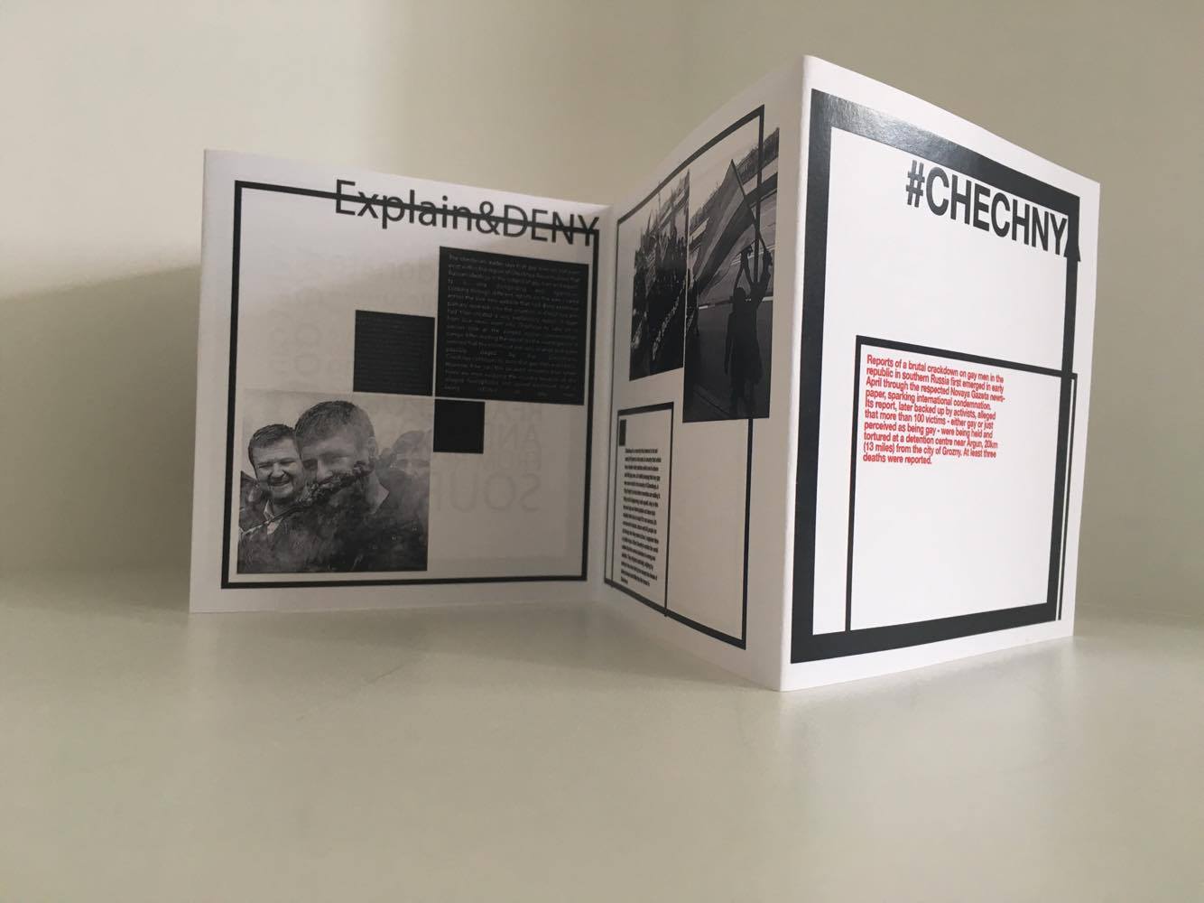
Below, placed a snapshot of relevent information from the online proejct informatiopn source.


When my tutor orlando was expplaining this proejct to me I became failry interested quickly and it was nice to have a chnage in proejct comapred to previous tutors droning on with unispiring projects.

The goal of this project will be to experience the sound of a vast amount of music 'MicroGenres', by using a website which was archives 100's of different (MG) music examples. Then to choose one of the MG that would become the focus of this proejct. 

To then take the chosen MG and research it's origin and other relevant information up until the point I feel that I hav e gained enough knowledge to comfortabbly understand the Genre to a full extent and then design a response through which ever medium prefered.

Using the link provided, research into various MG's could begin, As you can see below from the screenshot of the MG archive, there is a vast amount of various MG's to choose from.


Monday, 14 August 2017

(NEW) OUGD505 - SB02 - Stock choice, binding choice and cover choice


The choice in stock

The most cost effective way to produce my booklet design at a mass scale I found would be to print the design on mid-sheen card at 160-180gm.
The main reason for this is the binding technique.

As I have planned to fold these designs as booklets, the thickness of the card is very important. Using 160gsm keeps the folds of the card from breaking or cracking easily over time, keeping the design looks professional. Another reason for the choice in stock is durability. As my booklet design is created to be small and convenient, it is more prone to damage and saturation, Using this chosen thickness of stock provides some protection again scratching and bending.

The third reason for my choice in stock is to display a more professional look. A slight sheen to the paper works wonders for images and color in and out of the booklet design. Reflecting light from these elements creates a more professional and premium look.

The choice in binding

My choice in folding the booklet design is the key to keeping mass production, cost and time effective. Folding requires no extra material and it keeps singular production of the design much more time effective. This also means that there is less. chance of there being any mistakes when it comes to the binding method of the booklets. 


Simple cover choice

I have decided to not choose a different design method for the front and back cover of the leaflet. The main reasons for this are that it keeps the mass production of the booklet design cost effective. Secondly, it would be difficult to combine a second type of stock towards a booklet which has been designed to be folded back onto it'self as the binding method would suggest. 

(NEW) OUGD505 - SB02 - Product Range and Distribution


Getting the Booklets out into the public eye

An amazing way to get my booklet designs into the public eye, to have them seen by people and to have the ability to influence and help is to use the connections and social power I already have personally. Over time I have managed to become very good acquaintances and contacts with many independent coffee shop managers and quite a few managers of bars which over the years have become very popular with customers.

The reason I have such strong contacts with these people is that they fully support the subject of which my booklet design expresses. This would allow me to feature my designs in many establishments in West Yorkshire for free, including Leeds, Huddersfield, and Manchester therefore not only building up an audience for the #CHECHNYA booklets but also increasing the reputation for myself as a designer.

Along with these pro's, I have also built over time, several thousands of followers on Facebook and other social media. This social media pro would also be very beneficial in increasing an audience towards my designs and at the same time creating quite a strong level of awareness about the issues on which my booklet design represents.

Cost effectiveness

If my booklet designs were to be mass produced then to keep the cost down booklets would be printed small, using a local printer that I have used and trusted for many years to print of my projects, my booklet design for SB02 included.

50 copies of the designs at their current size and sheen stock gsm would cost £70 in total. Increasing the amount of copies I print would then initiate a discount would again decrease the cost of mass production. That is if the designs were to become more popular with my audience.


(NEW) OUGD505 - SB02 - Further Research into Issues in Chechnya


The French President Emanuel Macron states his position, expectations and views on the current issues of alleged abuse and prosecutions of gay men in Chechnya

The French president states strongly his disapproval of the reports of abuse to gay men in Russia.

French President Emmanuel Macron did not mince his words during his first meeting with Russian leader Vladimir Putin on gay rights, chemical weapons and alleged cyberattacks.

Mr Macron warned Mr Putin that chemical weapons in Syria were a “red line” for France and that he would monitor further civil rights violations of gay people in Chechnya.

“I had the chance to bring up how important it is for France to respect all people, all minorities and all sensibilities in a civil society,” he said, as Mr Putin stood beside him listening to the translation.

He confirmed that Mr Putin had agreed to a “very regular monitoring” of the curtailing of gay rights in Chechnya, where hundreds of gay men were rounded up, sent to prison and tortured. At least 26 gay men have reportedly been killed.

Mr Macron said the Russian leader told him he had attempted to “establish the complete truth on the activities of local authorities” but did not provide details.

“As for me, I will be constantly vigilant on these issues, which are in keeping with our values,” Mr Macron said.

His words follow condemnation from other European leaders, such as German Chancellor Angela Merkel, who said she urged Mr Putin after a meeting in May to “use his influence to protect these minority rights”.

Mr Putin did not mention gay people during the conference with Mr Macron. 

Chechen leader Kadyrov denied earlier this month that gay people were being persecuted, saying homosexuals “do not exist in the republic”.

An interesting report which shows the involvement and support from countries such as France, also explaining the level of response and interest shown by Russian Officials.


http://www.independent.co.uk/news/world/emmanuel-macron-vladimir-putin-gay-rights-chechnya-russia-france-syria-conflict-civil-war-assad-a7762591.html